Barron's & MarketWatch Homepage Replatform
The Barron’s Home Page Refinements FY24-25 project began to address several challenges and opportunities identified through user behavior, competitive analysis, and stakeholder input.
Hypothesis
The hypothesis driving the project was that the current Barrons.com homepage, last redesigned in 2020, does not fully meet user needs, editorial goals, or business objectives. Specifically:
User Experience Shortcomings:- Slow load times, leading to user frustration and drop-offs.
- Lack of flexibility in layout, hindering adaptation to editorial priorities or user preferences.
- Missing personalization tools, reducing engagement opportunities.
- Inconsistent content hierarchy, making it difficult for users to find timely stories.
Editorial Challenges:
- The homepage did not reflect Barron’s editorial voice and content pillars effectively.
- Content curation was constrained by rigid tools and time-intensive processes.
Business Needs:
- Missed monetization opportunities, such as optimized ad placements and native advertising.
- Subscribers and advertisers lacked sufficient tailored content or visibility.
Competitive Landscape:
- Competitors offered advanced features like personalization and multimedia, setting higher user expectations.
- Better-structured competitor homepages drove engagement and conversions.
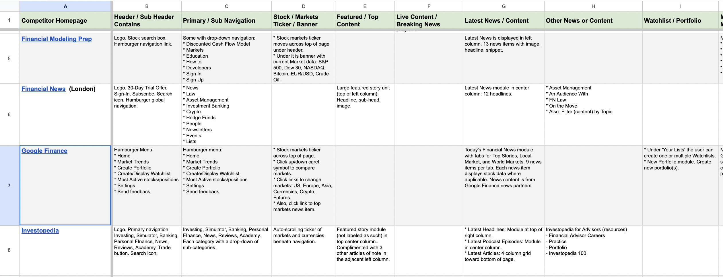
Competitive Analysis Spreadsheet
Key Assumptions:
- Improving speed, layout flexibility, and personalization enhances user satisfaction, retention, and subscriptions.
- Elevating editorial content and offering differentiation will better serve audiences and editorial goals.
- Aligning with market trends will position Barron’s as a competitive leader in financial news.
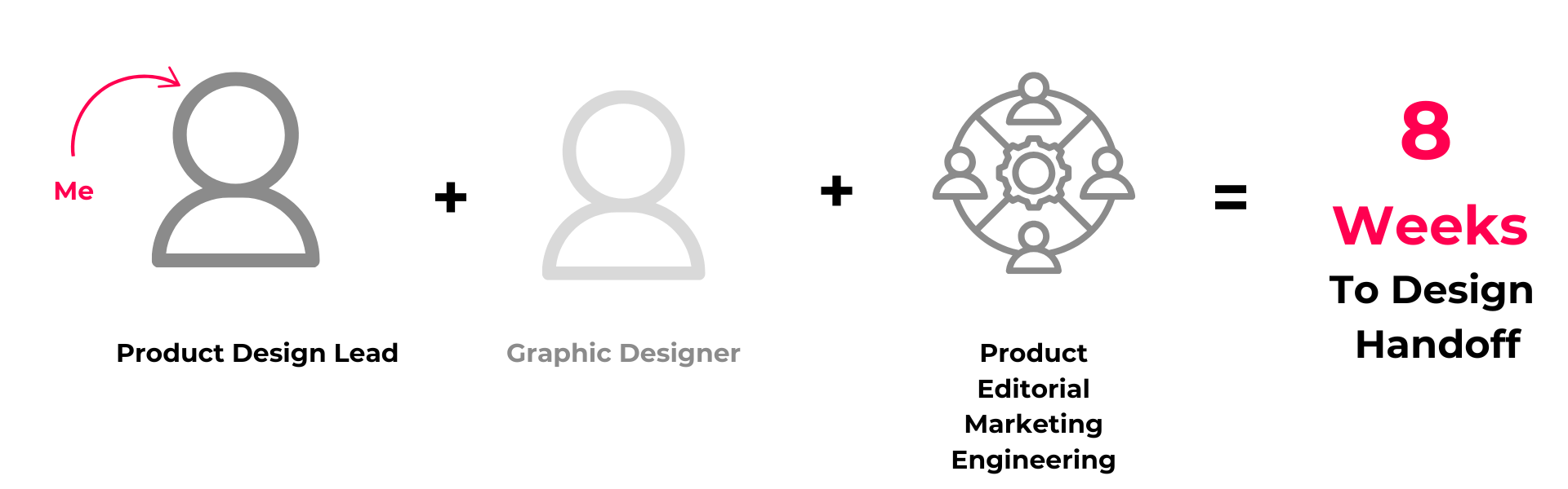
I was the Product Design Lead, responsible for developing the design strategy, leading workshops, analyzing existing research, collaborating with Engineering, and creating the key deliverables (functional specs, high-fidelity wireframes, etc.)
Problem
The Barrons.com homepage was identified as a bottleneck for delivering optimal user experiences, meeting editorial objectives, and achieving business goals. Problems included:
User Experience Issues:- Slow performance and suboptimal metrics impacting retention and SEO rankings.
- Static layouts with no personalization or dynamic content features.
- Confusing content hierarchy and inadequate mobile optimization.
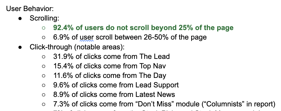
In the data below, you can see that our users did not see much value in our home page. Less than 8% of users even went past the Top Stories section! We crafted various solutions to encourage users to the value of the home page, like putting personalized content in the right rail of the page.
Editorial Challenges:
- Rigid CMS restricted layout flexibility and alignment with priorities.
- Time-intensive updates and poor content showcasing.
This research was done by our UXR team, and was absolutely essential to our design process!
Business Limitations:
- Missed ad monetization opportunities and insufficient subscription CTAs.
- Lack of features like trending sections and multimedia integration.
Approach
To address these challenges, a collaborative, research-driven, and iterative process was employed:
Stakeholder Workshops:- Involved editors, product leaders, and business leaders to align on goals, prioritize features, and identify pain points.
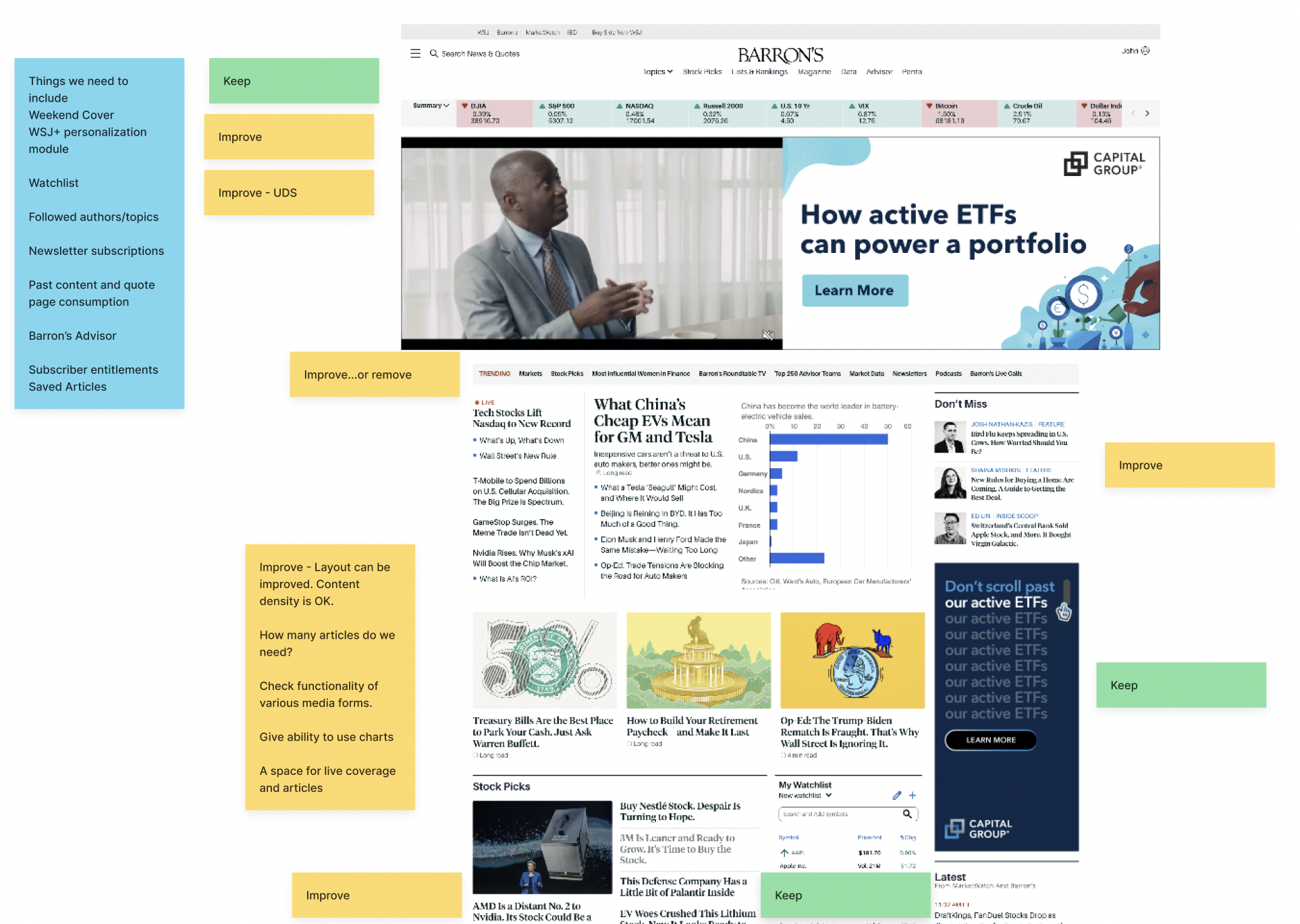
For redesigns, I always do a workshop called Keep, Improve and Remove with Product so we get an idea of their expectations. Some stuff is off-limits, but others are fair game. The earlier we know, the better!
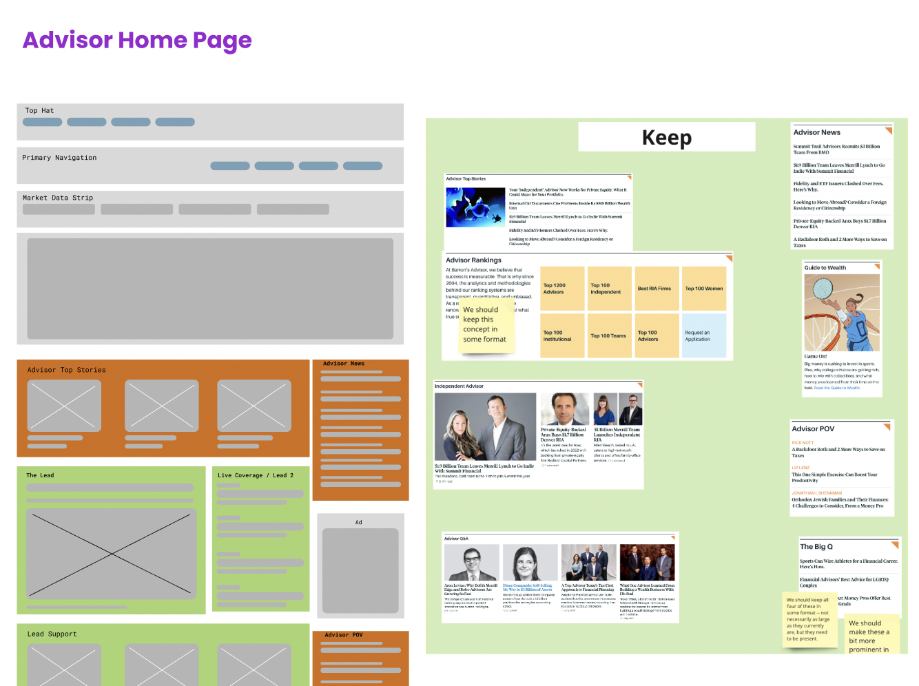
Barron's Advisor is a sub-brand of Barron's, so we had to do a workshop in Miro + Figma specifically with those stakeholders
Research and Insights:
- Reviewed customer feedback, analytics, and prior UX research to identify critical paths and opportunities.
- Mapped editorial workflows and inefficiencies.
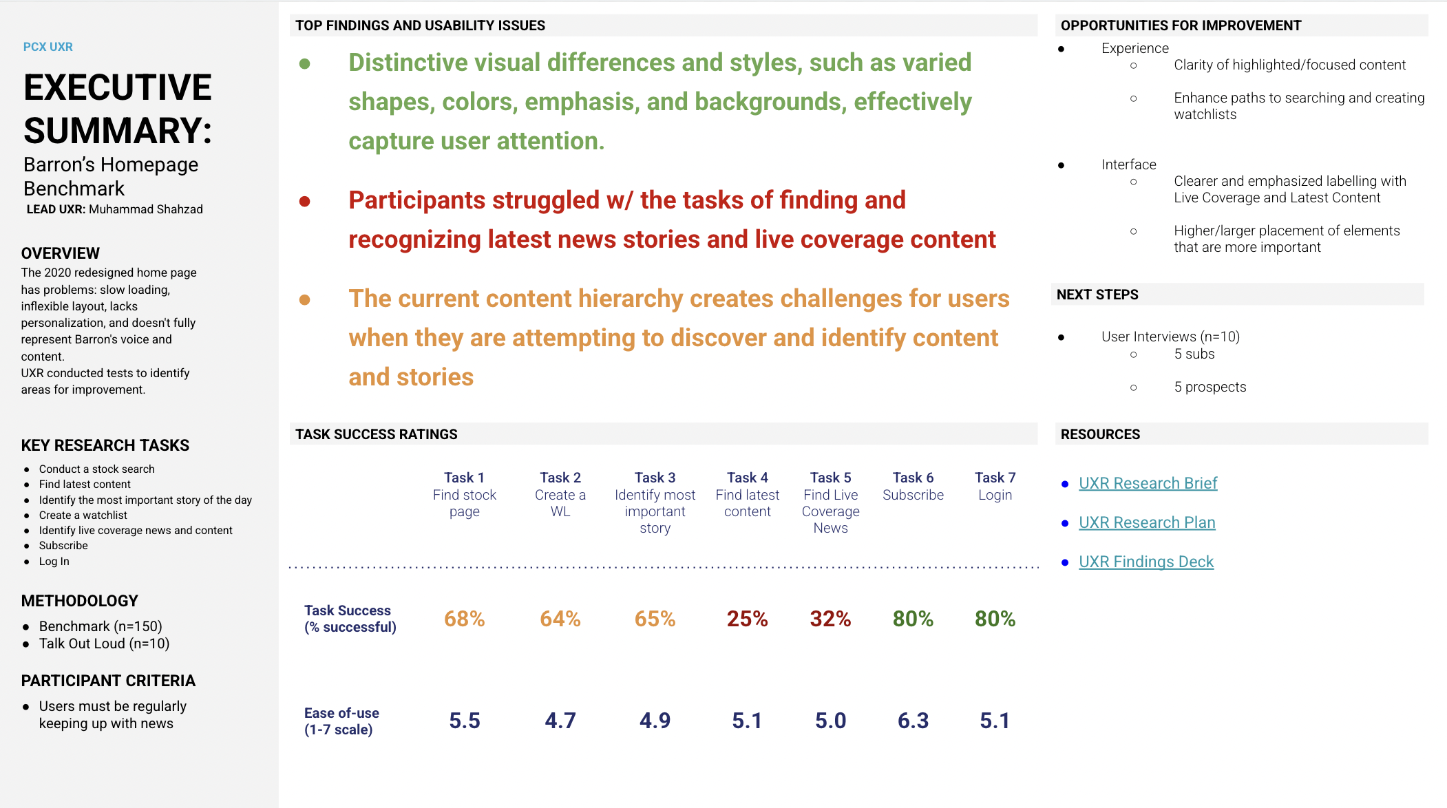
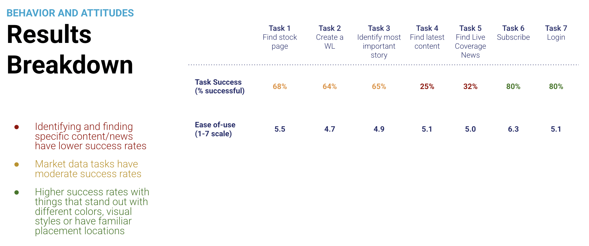
Results from usability testing showed that users have difficulty identifying where the latest content is and which articles offer live coverage. To solve for this, we designed a live coverage timeline that editors could toggle on or off.
Iterative Design Process:
- Collaborated on sketches, wireframes, and prototypes.
- Conducted usability testing and iterated designs based on feedback.
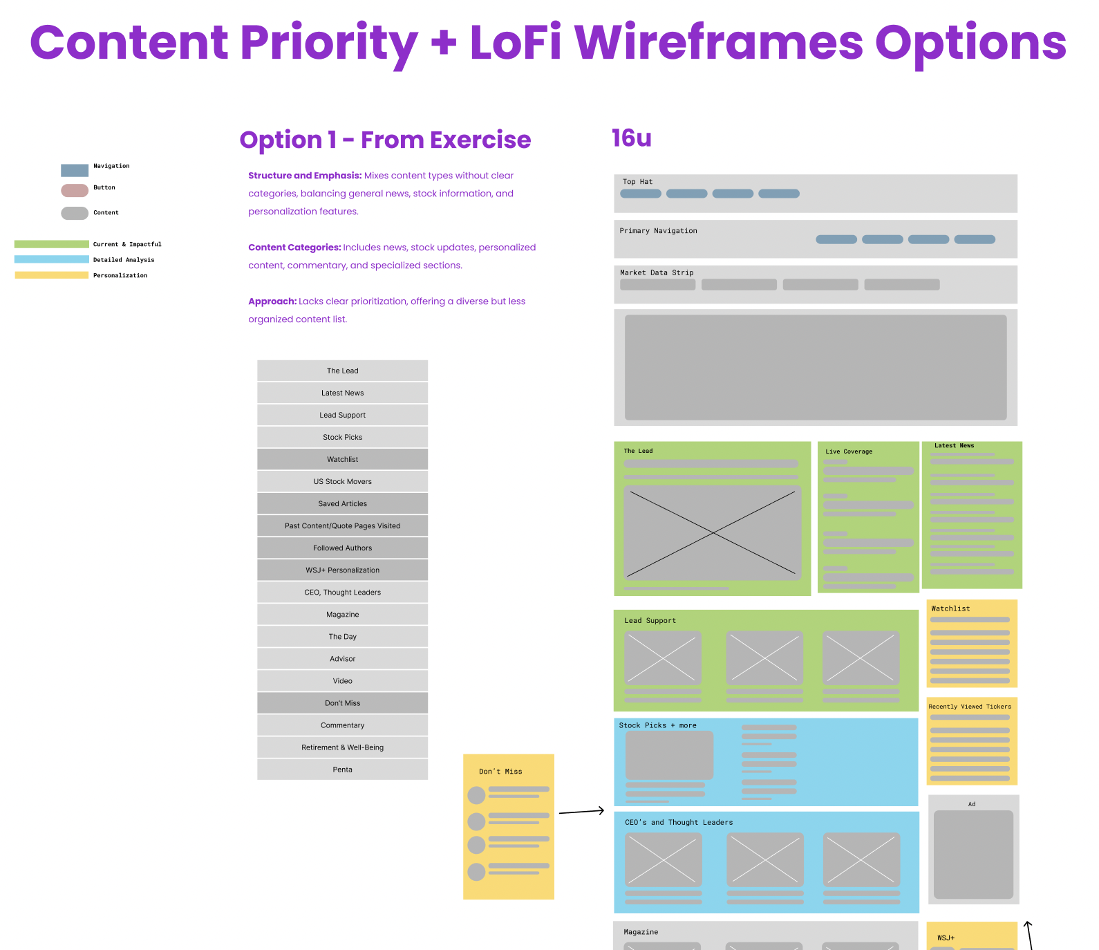
Content Prioritization allows us to align with key stakeholders on the heirarchy of content on the page before we jump into designs. Lo-Fi wires allow them to get an idea of where things should go. We also color-coded sections based on the type of content.
Technical Collaboration:
- Defined performance benchmarks and integrated personalization engines.
- Established KPIs like engagement rates, subscription conversions, and ad revenue growth.
Output
The project produced a user-centric, flexible homepage design that balanced editorial priorities, user satisfaction, and revenue growth.
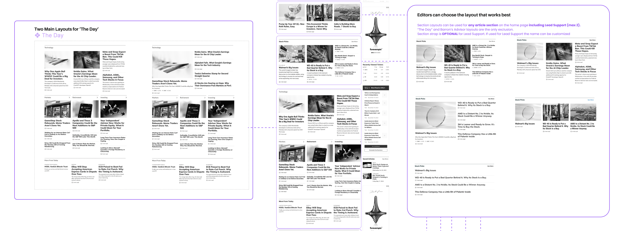
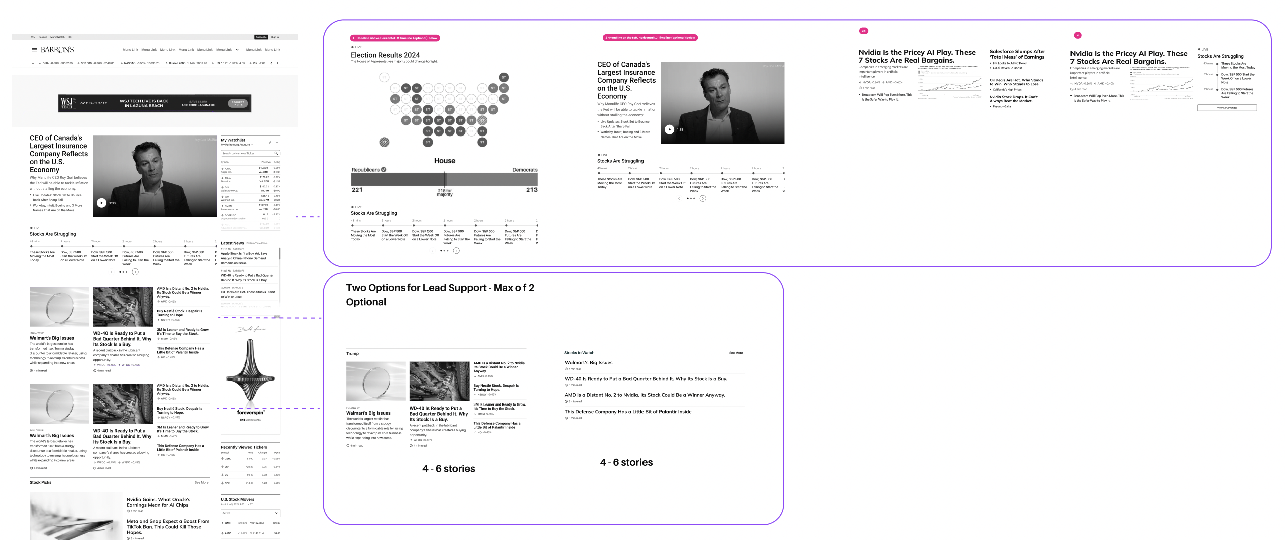
We presented the editors with 5 options for The Lead (The Top Stories), and two additional sections for lead support, that can adapt based on editorial needs.
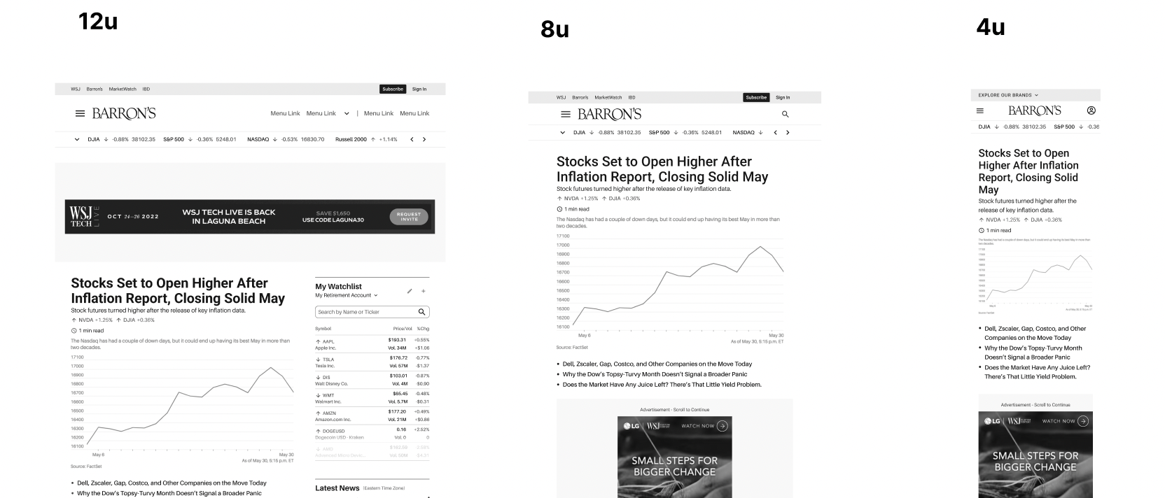
We created designs for all breakpoints to ensure a smooth user experience for users on vaious devices.
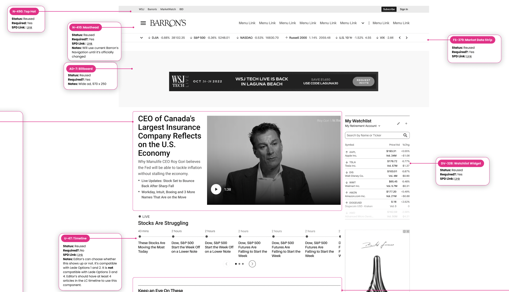
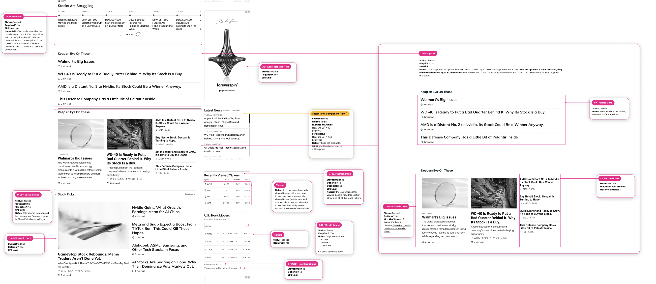
We provided functional specs for devs for each component. We also mapped each component to our design system to facilitate the development process.
Here's a video of the default full home page experience. Editors can swap out most of these sections to suit their needs.
Potential Outcomes
Customer Impact:
- Bounce rate could decrease by up to 15%, with page load times improving by as much as 40%.
- Content discoverability may improve by 25% through clearer layouts and personalized recommendations.
- Net Promoter Score (NPS) could increase by up to 12 points with a more engaging, user-centered experience.
Business Impact:
- Subscription conversions could rise by 18%, with ad revenue potentially growing by 12%.
- Time on site may increase by 22%, with users clicking 30% more on premium content.
- Editorial workflow efficiency may improve, reducing content publishing time by 30%.
The redesign achieved measurable results, transforming Barrons.com into a competitive, user-centric platform that aligned with editorial and business goals.