WSJ+ Dashboard 2.0
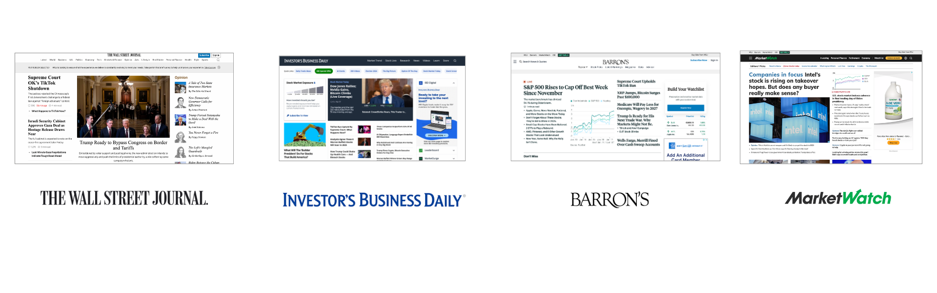
The WSJ+ Dashboard 2.0 project was initiated as part of an effort to enhance the user experience by creating a more dynamic and personalized content hub that aggregates news from multiple Dow Jones brands, including WSJ, Barron's, MarketWatch, and Investor's Business Daily.
The goal was to provide a seamless, customized experience where users can access top news stories, personalized content, market insights, and other related features across these platforms in one unified location.
Hypothesis
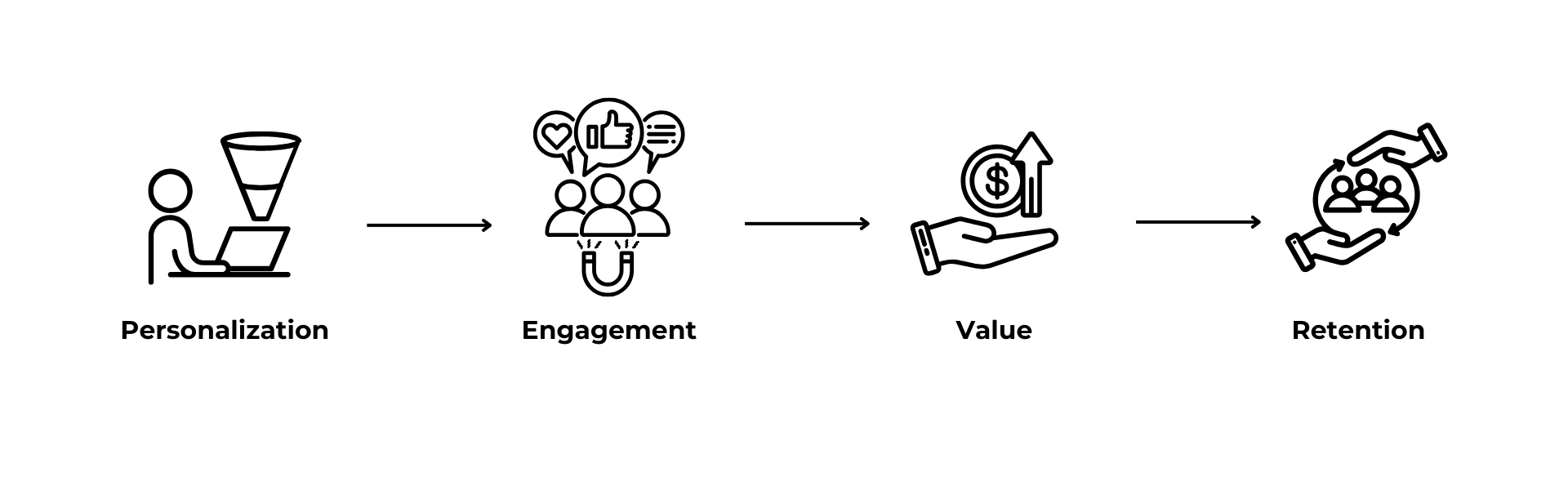
The initial hypothesis was that by centralizing content and offering tailored, engaging news experiences, users would be more likely to engage with the platform and retain higher levels of interaction. Key assumptions included:
- Increased Engagement: Providing a curated and personalized dashboard would encourage users to spend more time on the platform, as they could access content tailored to their interests and preferences.
- Improved Content Discoverability: Aggregating diverse content from across Dow Jones brands in an organized and intuitive layout would make it easier for users to find and explore relevant articles, stories, podcasts, and market insights.
- Customization Drives Value: Empowering users to personalize their content preferences would lead to higher satisfaction and better content relevancy, ultimately improving retention and user loyalty.

This hypothesis was supported by the idea that news consumption today is increasingly fragmented, and users seek convenience, personalization, and quick access to content from multiple trusted sources. By centralizing this experience, WSJ Dashboard 2.0 aimed to streamline that process and drive both customer satisfaction and business performance.
Problem
The WSJ Dashboard 2.0 project faced several key challenges:
- Content Overload vs. Simplicity: Aggregating diverse content from multiple Dow Jones brands (WSJ, Barron's, MarketWatch, Investor's Business Daily) without overwhelming users. The goal was to balance informative richness with a minimalist, user-friendly layout.
- Brand Identity: Ensuring the design reflected each brand’s unique style while maintaining a cohesive visual experience across the platform.
- Customization: Creating an intuitive customization system that allowed users to personalize their experience without cluttering the interface.
- Responsive Design: Ensuring the dashboard was optimized for desktop, tablet, and mobile, offering a seamless experience on all devices.
Approach
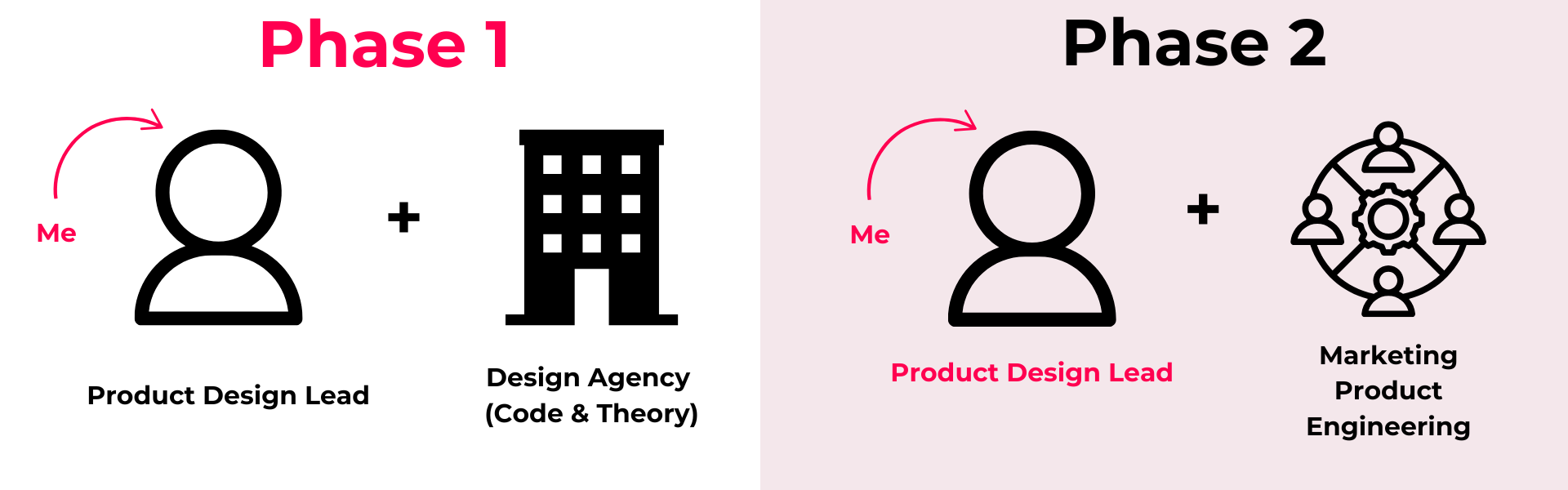
The approach I took involved several key steps to ensure the project was aligned with both business goals and user needs. As the Product Design Lead, I was responsible for:
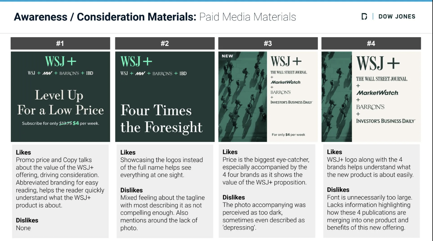
- Research and Insights: Conducted in-depth research on user needs, preferences, and pain points, leveraging both existing insights and new data collected throughout the project. Incorporated customer feedback to ensure the design was user-centered and intuitive.
- Collaborating with the Agency: Provided design direction to the agency, ensuring their recommendations would align with the overall vision, brand identity, and technical requirements of the company.
- Turning Recommendations into Designs: Translated the agency’s recommendations into actionable designs, ensuring they fit within our design strategy, tech stack, and platform capabilities.
- Workshops and Stakeholder Alignment: Organized and led workshops with cross-functional teams, including product, editorial, and business leaders, to align on the project vision and goals. Facilitated stakeholder alignment meetings to ensure everyone was on the same page and that priorities were clear, keeping the project on track.
Output
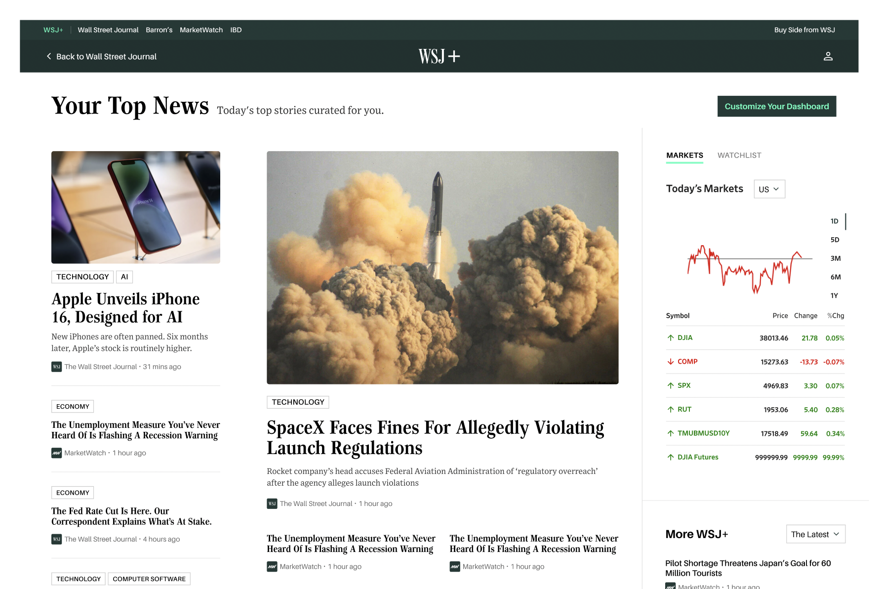
Top News - 16u Design - This is our most viewed section, so we wanted to create a clear heirarchy, prominent imagery and intentional spacing.
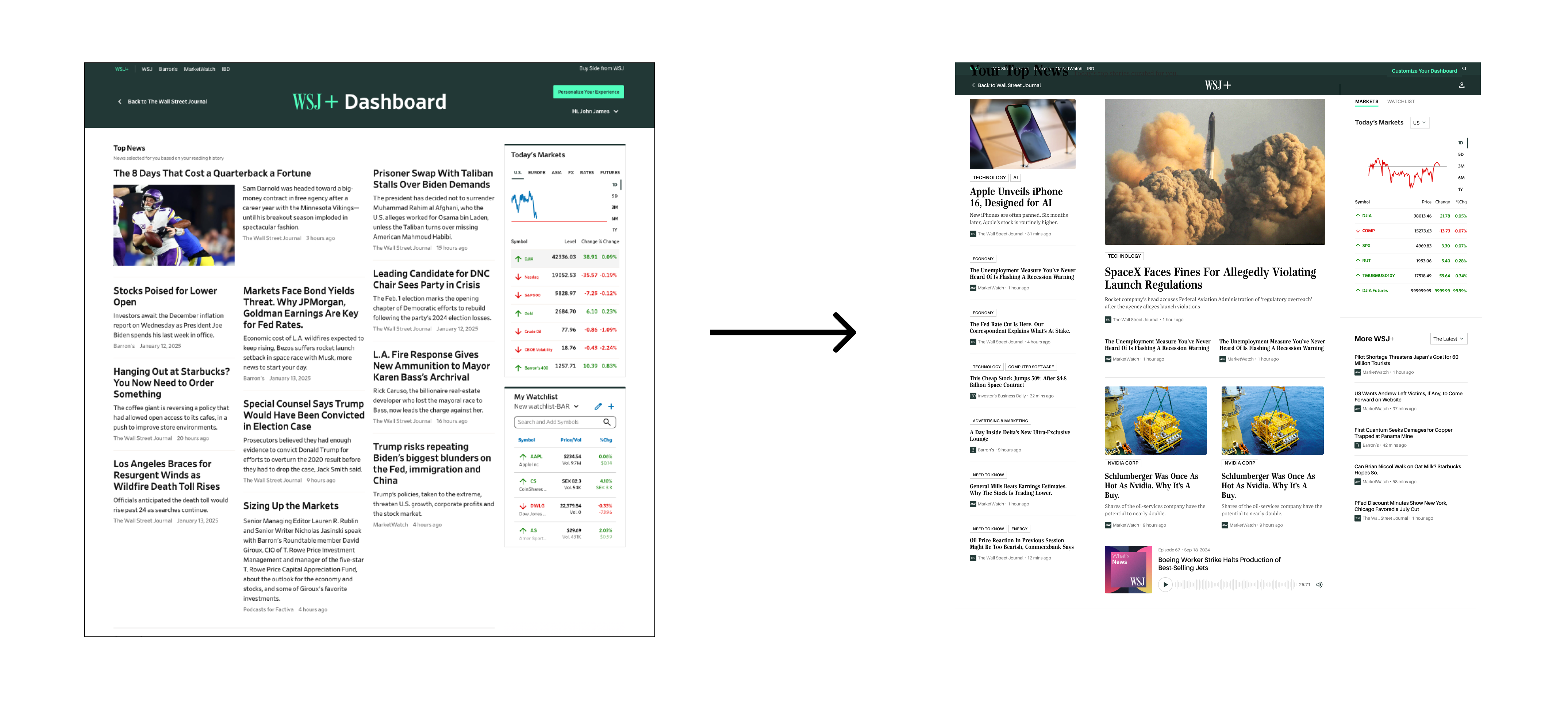
Some of the mobile views -- we designed for all breakpoints to ensure a smooth experience for users on all devices
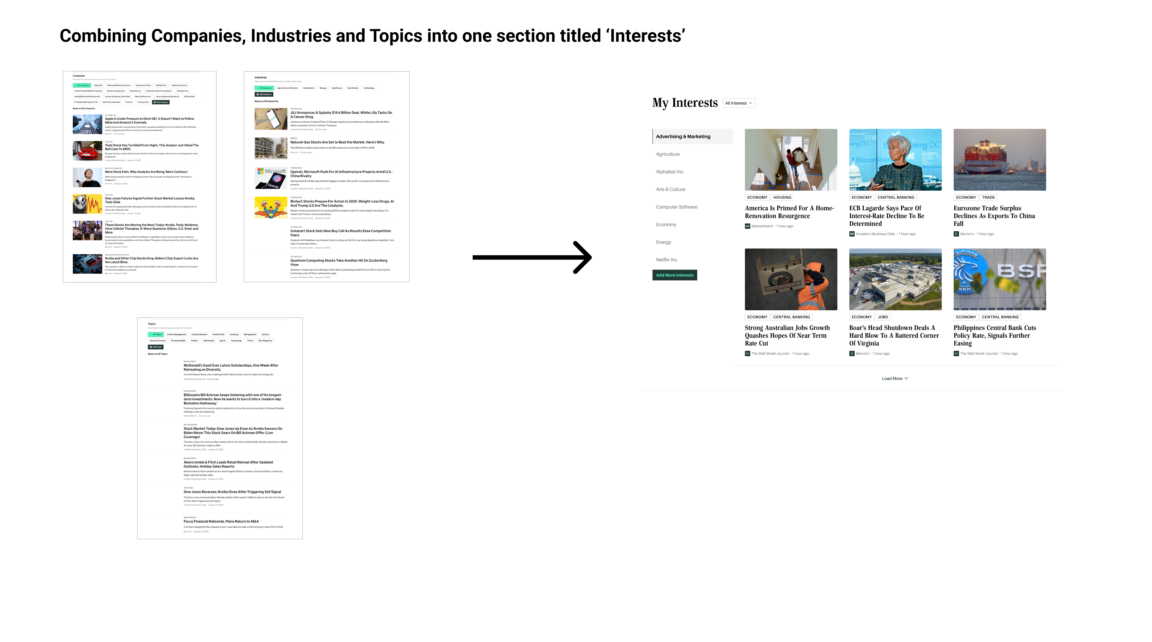
Consolidation of Companies, Industries and Topics into an 'Interests' section. Most people weren't scrolling past the Companies section, so we want to pack more value into a smaller space for easy discovery.
Video of WSJ+ Dashboard (Top News + Interests)
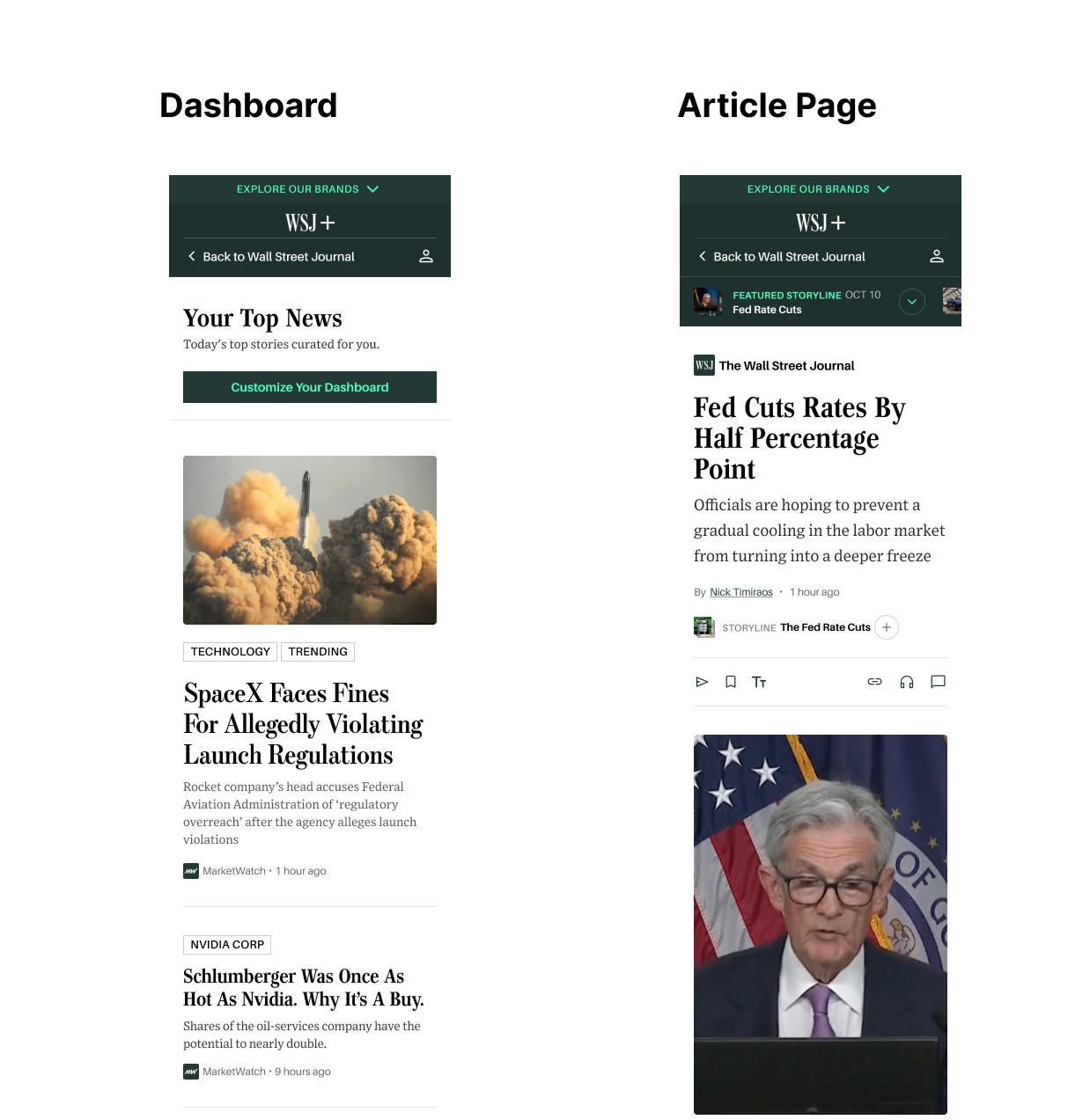
Endless Reader article layout to increase on-page time
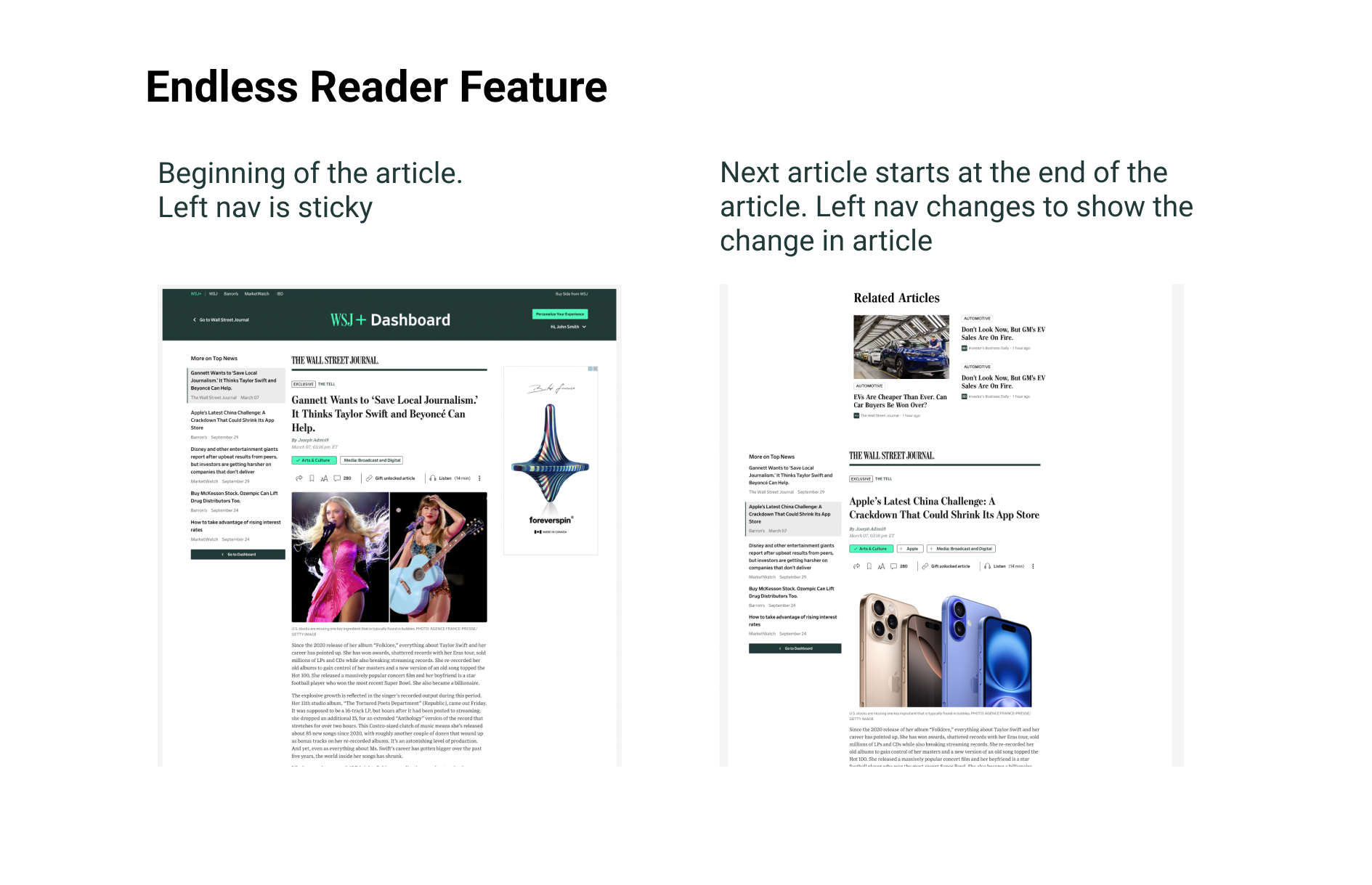
Video of Endless Reader experience. Left rail would be sticky the entire time so users can easily jump between articles, but I was limited by the Figma prototype tool.
Outcome
The impact of this project is still being evaluated as it is currently in development. However, the expected outcomes for both customers and the business are significant:
Customer Impact:
- Increased value perception of the bundled subscription, as users will find more personalized and relevant content across Dow Jones brands.
- Improved user experience with streamlined, customized content, leading to better engagement and satisfaction.
- Empowered users to track topics they care about, resulting in more frequent interaction with the platform.
Business Impact:
- Increased subscription retention due to enhanced content relevance and user satisfaction.
- Strengthened cross-brand engagement, fostering deeper connections across the Dow Jones portfolio (WSJ, Barron's, MarketWatch, etc.).
- Better targeting for future content and advertising, improving overall monetization strategies.
Potential Metrics to Achieve:
- 13% increase in click-through rates (CTR) on personalized content and storylines.
- 12% improvement in subscription retention rate, driven by the enhanced value of the bundled offering.
- 18% increase in cross-brand engagement, measured by users interacting with multiple Dow Jones properties.
- 24% improvement in content engagement, tracked by time spent on the platform and article interactions.
These metrics will help measure the effectiveness of the redesigned dashboard in achieving its goals.