Wall Street Journal Preference Center
Personalization in news is the new norm. Gone are the days of giving everyone a cookie-cutter newspaper on their front porch. Now, everyone wants news that is personalized for them.
On this project, I served as the Senior UX Architect on what would become the corner stone of the WSJ’s personalization journey. I collaborated with a fellow UX Designer that focused more on brand styling, but I led the entire UX process from end to end.
Understanding the Goal
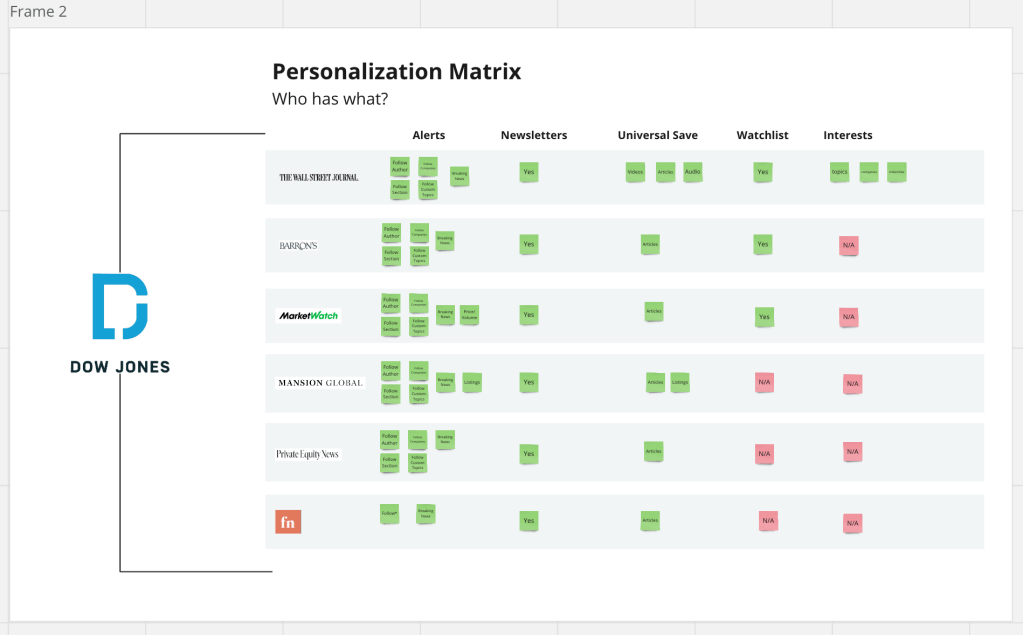
Dow Jones is made up of various brands that deliver high quality financial news. Some notable brands are:
- Wall Street Journal
- MarketWatch
- Barron’s
- Investor’s Business Daily (IBD)
Collectively, over 100 million users rely on these brands to find news they trust. More specifically, readers want news that is relevant to them. They don’t want to just see any financial news story, they want to see the news that is hand-picked for them.
The WSJ Preference Center project was introduced to solve this problem: how do we find out what our readers want to see?
Third party analytics only go so far — the best way find out what they want is for them to tell us. But, how do we get them to do that?
That leads us to our mission: Create a Preference Center to collect and store valuable information about our readers for the purpose of presenting relevant, personalized news at all times.
Understanding the Data
“Let’s jump in Miro and figure this out!” is a common saying on our UX Team. Before we dive into designs, we have to understand the data. In this case, the data was the type of information we need to display in the preference center.
After collaborating with the product manager, we determined that along with finding out the interest of the readers, we needed to provide a place for users to manage their email alerts, newsletters, saved content and watchlists.
What do we need to include?
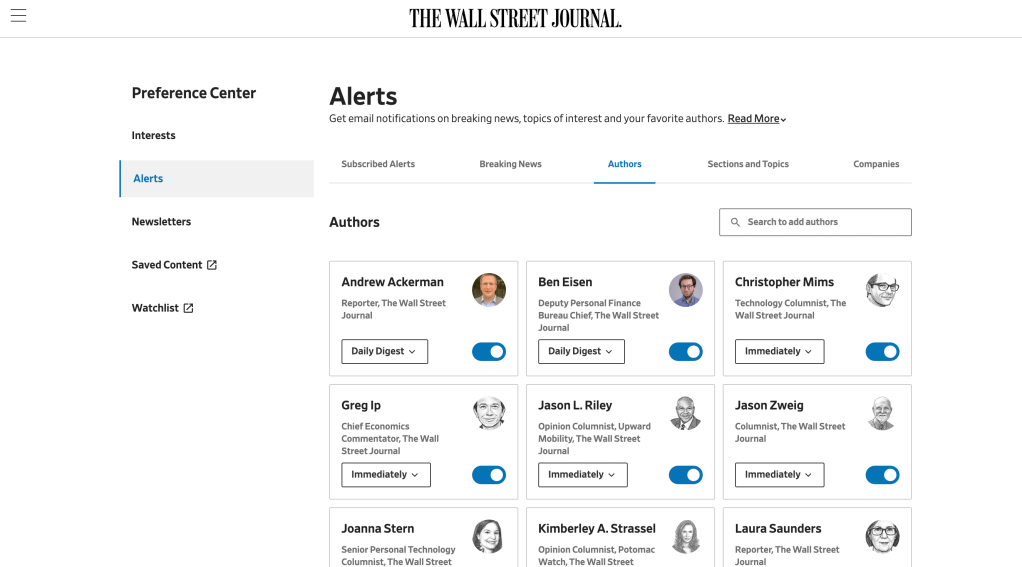
Alerts
There are many type of alerts: breaking news, author updates, popular topics, things like that. These things come directly to your email you need an easy place to turn them on or off.
Newsletters
Newsletters are essential for online media companies. When users sign up, they no longer have to actively go to the site to read the news, we send bite-sized pieces to them daily/weekly depending on their preferences. The has a profound effect on readreship
Universal Save
Do you ever save/bookmark something and have an issue finding it later? Yeah, me too. We had to create a home for saved content so users could easily find saved articles and videos all in one place.
Watchlists
Financial News means nothing without a good watchlist, so we had to design a place where users could easily track their stocks and keep up with what’s important to them
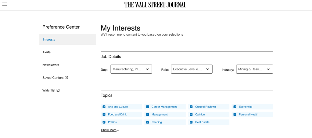
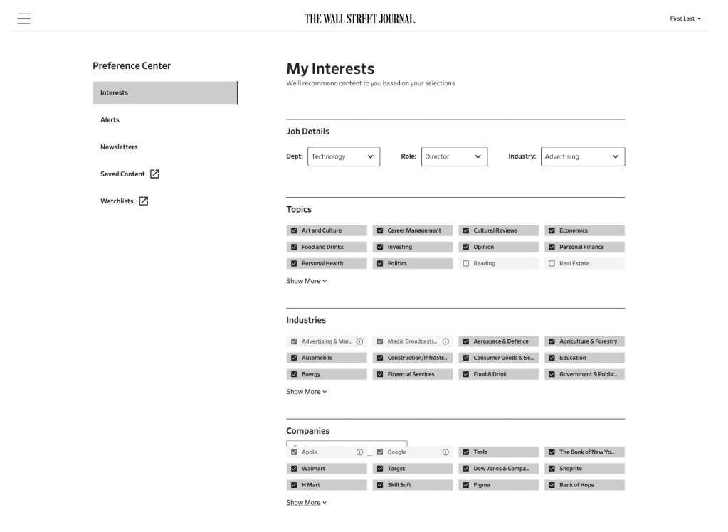
Interest
What do you like to read about? What companies do you want to follow? What industries are you closely tied to? All of these questions lead us to understand our readers more
Job Info
Are you entry-level or an exec? Design or project management? In manufacturing or retail? Simple info like this helps us serve relevant content no matter who you are.
As you can see, that’s a lot of data to put into one place. One of our main goals was to create a structure that didn’t cause cognitive overload, but as intuitive and simple to navigate.
Layouts That Scale
When you design with cross-brand implementation and scalability in mind, it makes you think about not only the solution that works for now, but the solution that works 10 years from now. What if more information needs to be added? What other brands want to show less? How do we allow each brand to include its brand identity while still remaining tied to the design ecosystem?
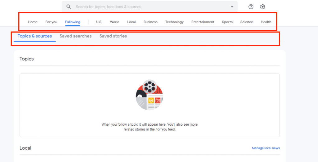
We looked at competitors to see how they lay out some of their content similar to a preference center.
All of the layouts have pros and cons. Here are a few of our key findings:
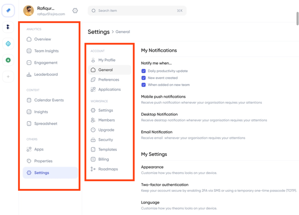
Grids show more content, but they can be visually overwhelming.
See how YouTube and LinkedIn utilize a grid to promote potentially relevant content?
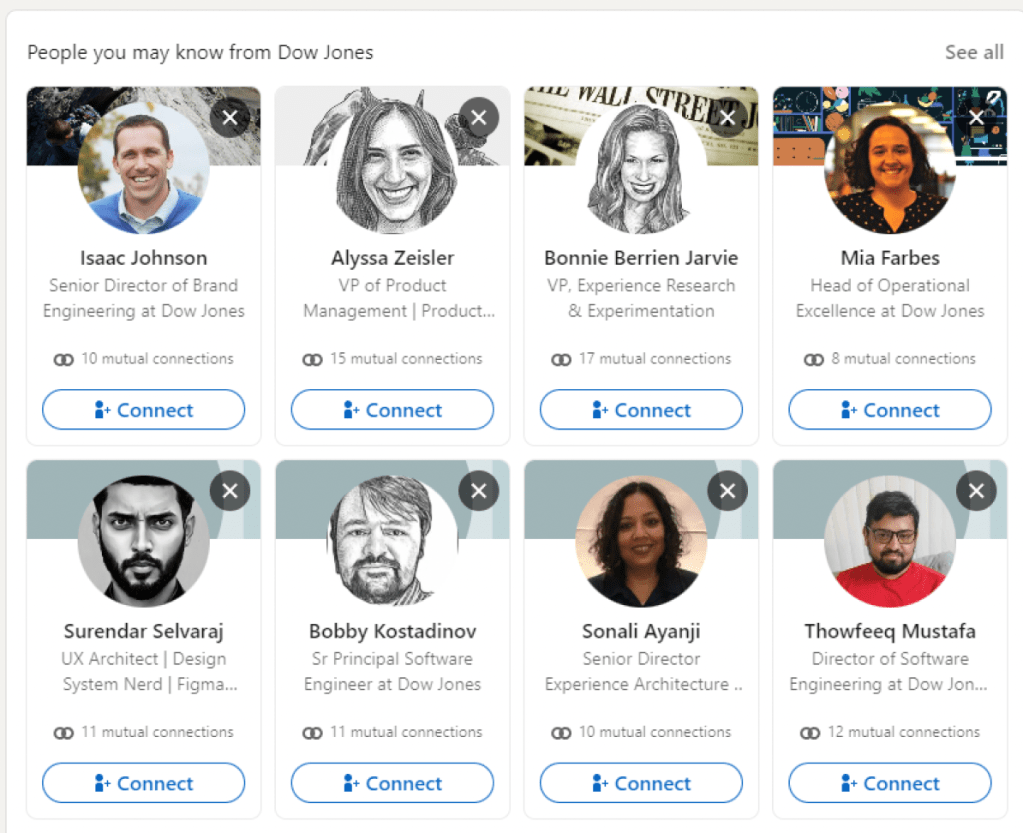
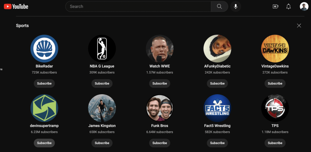
- Pros: You can show more content with using cards in a grid, which is valuable for high amounts of content
- Cons: It can look visually overwhelming and less intentional. It can feel crammed and may not actually increase interaction with the content compared to a simple list. [see below]
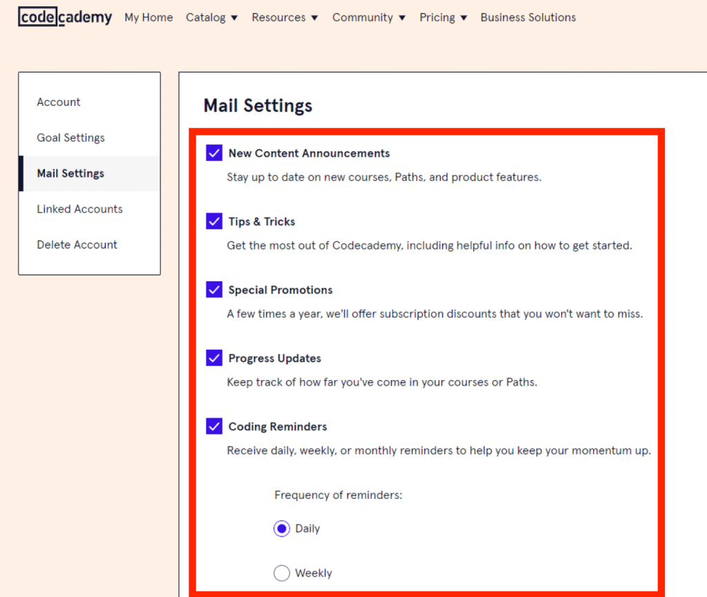
Tabs on Tabs on Tabs
Tabs can help us navigate, but they should be used with caution. Especially when you have tabs nested within tabs, it need to be implemented properly to reduce confusion. There are two ways to implement tabs
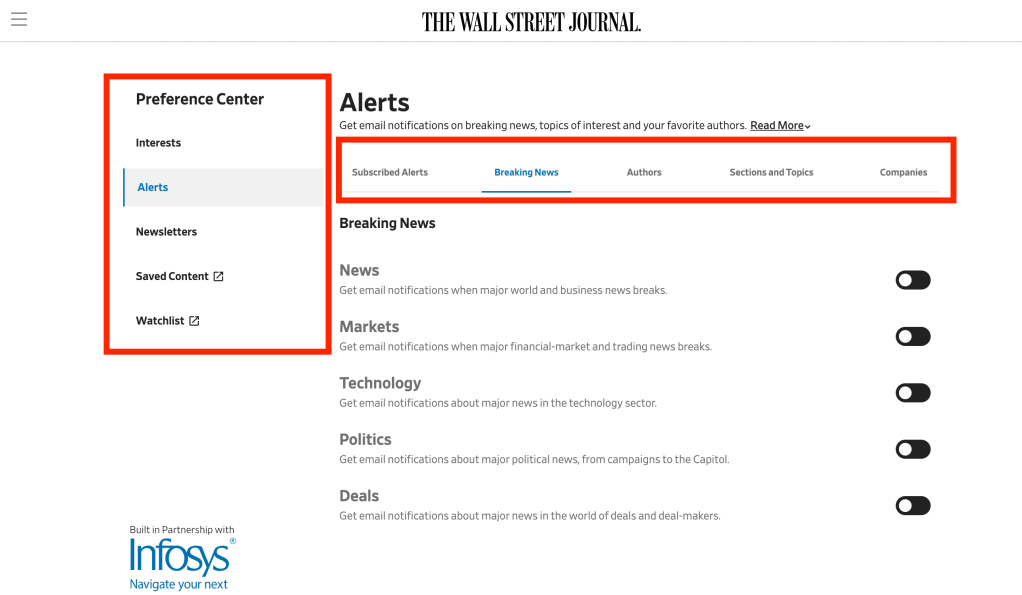
Left Tab + Top Tab
- In this scenario, the left tab is the primary tab and the top tab is the secondary tab. See the example below
Left Tab + Left Tab
- In this scenario, there are two layers of tabs on the left. The outermost tab is the primary tab and the innermost tab is secondary. See examples below
Top Tab + Top Tab
- In this scenario, there are two layers of tabs on the top. The uppermost tab is the primary tab and the one below is secondary. See examples below
Which one works best?
After testing with users and receiving internal feedback from design and product, we decided that option 1: Left Tab + Top Tab was the most intuitive way to set up the navigation for the alerts content. It resulted in a cleaner aesthetic and improved usability.
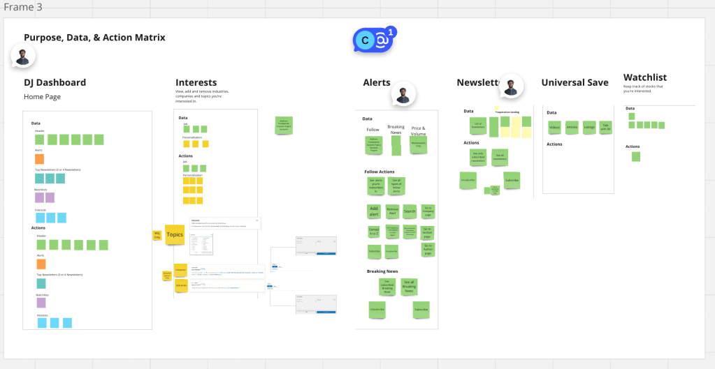
UX Architecture
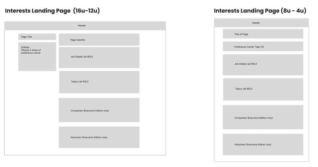
Content Massing allows us to see how the content will be laid out in the lowest fidelilty, even lower than a wireframe. This allows us to align with stakeholders on the placement of content before we jump into high fidelity wireframes.
Here’s how it looked for this project.
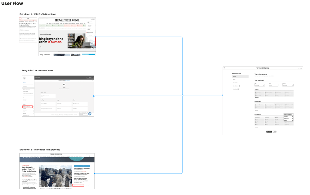
User Flows helped us understand all the pathways that could lead to the preference center. This helps us design for all situations.
Schematics lay out the placement of all of the components like a blueprint that’s easy for developers to follow.
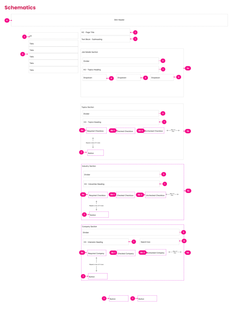
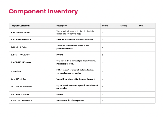
Component Mapping assigns components in our design system to each element of the schematics. We worked with product managers and key stakeholders to establish each element.
Different Layouts for Different Content
Adding Topics:
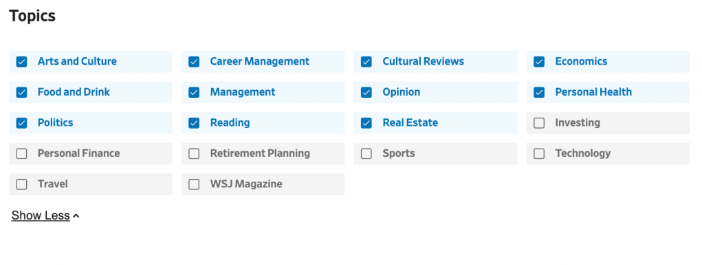
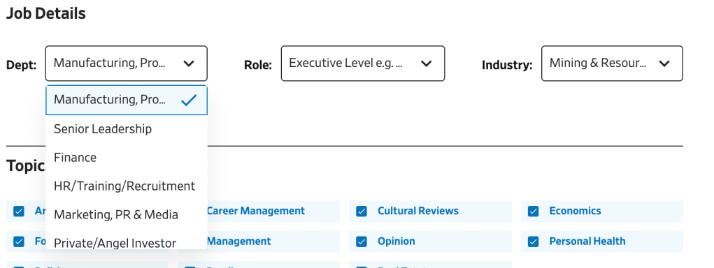
We have 18 topics that we want users to choose from, and we needed to find the best way to lay out the content. We went with a grid with checkboxes to show all of the topics at once compared to making them scroll through a linear list. Plus, there was not descriptive text or imagery necessary for these topics so we were able to balance aesthetics and functionality.
Adding Industries:
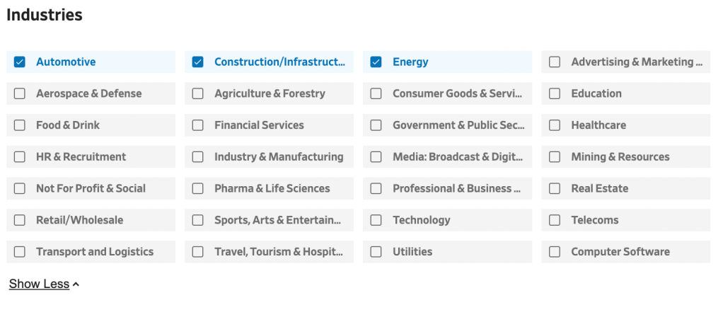
We used the same layout for industries, which worked well due to the finite number of options (28) and the importance of scanning.
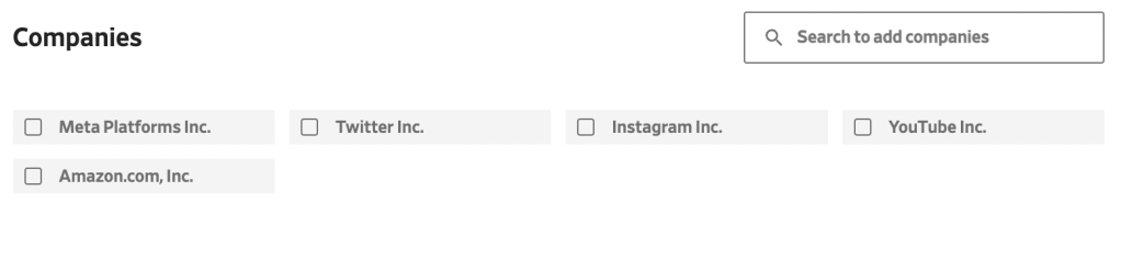
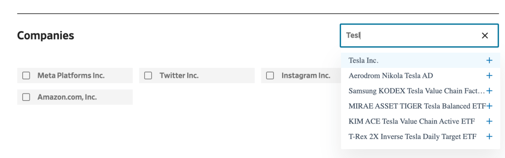
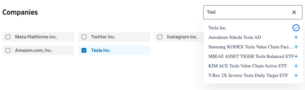
Adding Companies:
We utilized the stylized checkbox grid for the process of adding companies they’re interested in. There are thousands of companies, so we needed to find an easy way for people to add companies without using a modal. We created a simple 3 step process:
- We display popular companies so their companies list is never empty. This encourages users to get started.
2. Users can search and add a company by clicking the plus icon next to the company.
3. The company shows us in the their grid. It’s that easy!
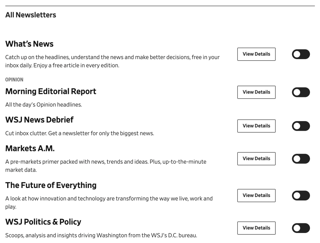
Following Newsletters:
We went with a linear list for newsletters so we could highlight our most popular newsletters and allow readers to easily go down the list and toggle the newsletters they want to subscribe to. The View Details button takes them to a landing page dedicated to that newsletter.
Providing Job Details:
We utilized a dropdown for the job details section because there were dozens of options for each of these (department, role, and industry) and you can only choose one option. Plus, this information doesn’t change frequently so it doesn’t need to take up much visual space.
Following Authors
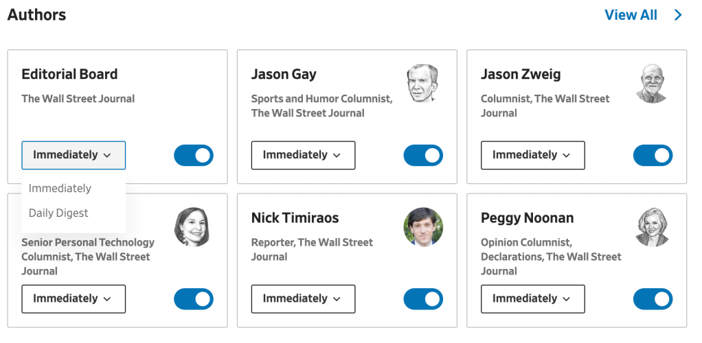
Even though the content is great on WSJ, what makes the brand are the authors. People know the authors by name and image, so we utilized a card grid layout to feature their name in bold, headshot, job title, an option to receive updates immediately or daily and the toggle button to follow them. This card can also be utilized across WSJ as a cross functional component.
The Final Result
Within about six weeks, we created all of the documentation necessary to handover the design to Infosys, the company who would be developing this on the WSJ website. It was a huge undertaking in such a short time, but I learned three key lessons.
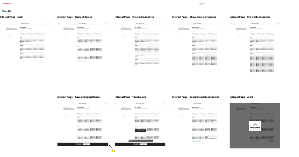
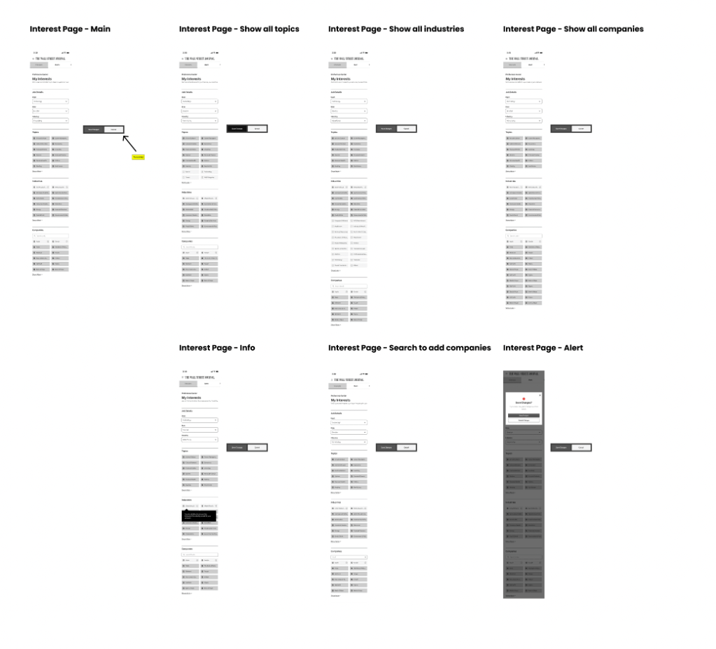
Wireframes (Interests)
Live Site (Alerts Page)
Wireframes for Desktop
Wireframes for Mobile
- Reduce, Reuse, Recycle
Yes, we’ve all heard it before, but it applies to design too! Finding components that we could reuse across the design were essential to being efficient. Reducing the number of new components used in the design ecosystem helped us get approval quickly and ensure everything would work smoothly for developers. Also, we created this to be brand agnostic, so it could be used for any of Dow Jones’ major brands.
2. Keep It Simple
Our users already have an understanding of how popular patterns work. Sometimes the key isn’t to create something brand new, it’s about how to manipulate existing patterns to work best for the situation.
3. Communication + Collaboration = Success
I set up daily standups with our product manager and designer to keep us on track. Frequent work sessions and checkpoints with senior leadership helped us finish before our deadline with full approval from all key stakeholders.
I hope you enjoyed reading about this case study! The designs are actually live in production now. If you’d like to try it out, go to https://www.wsj.com/preference-center/interests
Feel free to reach out if you have any questions.
