North American Plastics is the top wholesale plastics distributor in the country. With over $1 billion in annual revenue from their catalog of brands, their digital presence needed an upgrade to be on par with their prestige in the industry. I served as the sole UX Designer, Front End Developer and Graphic Designer in this complete redesign.
Challenge
Purpose
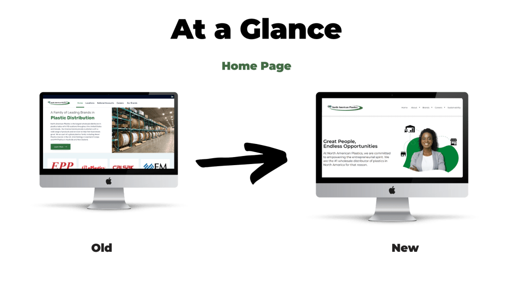
The plastics industry isn’t very progressive digitally. Most people just do sales over the phone or in person at trade shows, so their digital presence historically hasn’t determined their success. North American Plastics (NAP) wanted to improve their digital presence by making over their dated, clunky old website to a modern, progressive website that could bolster their digital identity.
Scope
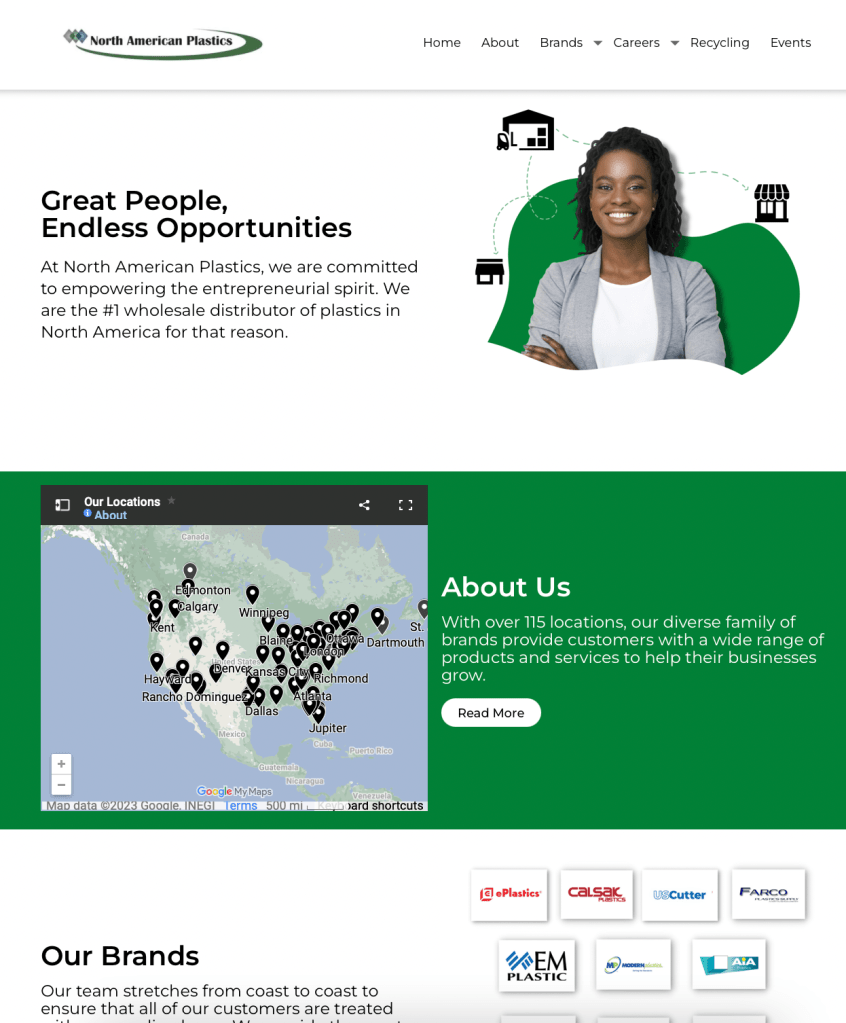
Even though some of NAPs brands sell online, this website was not eCommerce focused. The goal was to create a landing page for the brand that would showcase their capabilities, child brands and serve as a recruitment tool. The site was built in WordPress, and I needed to rebuild the site in WordPress to facilitate future editing.
Team
I worked with the Director of Digital Experience and two researchers/analysts to complete the project. I was the sole designer and developer working on the team, so our resources were pretty limited. We also had a time crunch and needed to complete the design in 8 weeks, which included end-to-end designs and development
Research
Our main goal of this project was not to produce a definitive visual design that would be adopted, but rather to identify the areas of improvement before moving to the visual design phase. For this reason conducting thorough research and research analysis was essential to elucidating those opportunities. Our main research methods were:
- Heuristic Analysis
- Competitive Analysis
- User Interviews
- Content Audit
Heuristic Analysis
We began this redesign project with a heuristic analysis of the site that was live at that time. There were many areas of improvement, but after conducting the analysis using Jakob Nielsen’s 10 general principles for interaction design, I identified three main areas of growth:
- Consistency and Standards
- The NAP site seemed to be thrown together with no clear strategy for why certain design decisions were made. The result of an unclear strategy was widespread inconsistencies and an absence of standards.
- Match between system and real world
- The previous site was geared toward experts in the industry who had very specific knowledge of the business. It did not cater to college-aged job seekers or first time buyers, both of which were target personas for this website. In the new site we needed to ensure we use easy to understand terms and images that make sense to a wide audience.
- Aesthetic and minimal design
- The look of the site was dated and simply unprofessional. The quality of the site was not commensurate with a $1B (billion) industry leader, primarily due to a cluttered layout and out-of-date design decisions.
Competitive Analysis
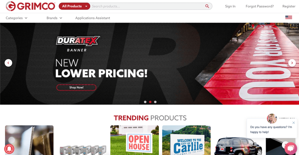
I analyzed some of NAP’s top competitors, chiefly Grimco to see what they offered that we didn’t. We extracted three key points from this analysis:
- Imagery Matters
- Typically in the plastics industry, people just show a bunch of stock images of plastic. The CEO told me he didnt want to be portrayed as just another plastics brand. In order to stand out, we needed to have people-centered imagery, not product-centered imagery.
- Keep it Simple
- The competitors with the most online traction typically had simpler layouts and highly usable sites. In order to succeed, we had to embrace simplicity.
- Don’t Follow Industry Trends
- The plastics industry is about 20 years behind other industries in terms of digital advancement. To ensure we stay ahead of the curve, we had to avoid copying our competitors. We needed to truly set the digital standard as the industry leader.
User Interviews
We talked with users, both leaders in the plastics industry and novices, via Microsoft Teams and we found three key themes:
- Trust
- Our website had careless technical errors and was visually displeasing. People expressed distrust in the brand due to these issues.
- Ease of use
- People had trouble finding information that they were looking for, which can lead to a higher bounce rate and shorter average page session durations.
- Disconnection
- People expressed that the content of the site was very dry and it looked very ‘corporate’. The CEO, Jason Askew, told me directly that he did not want to have a corporate feel, he wanted me to position the company as inviting, innovative and fun.
More Research
Even though we were working on borrowed time, we still amassed a strong catalog of research and UX architecture deliverables.
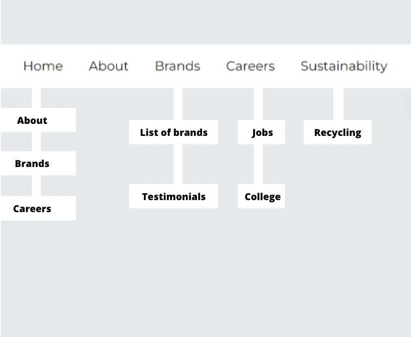
- Sitemap
- We restructured the information architecture and navigation structure of the site.
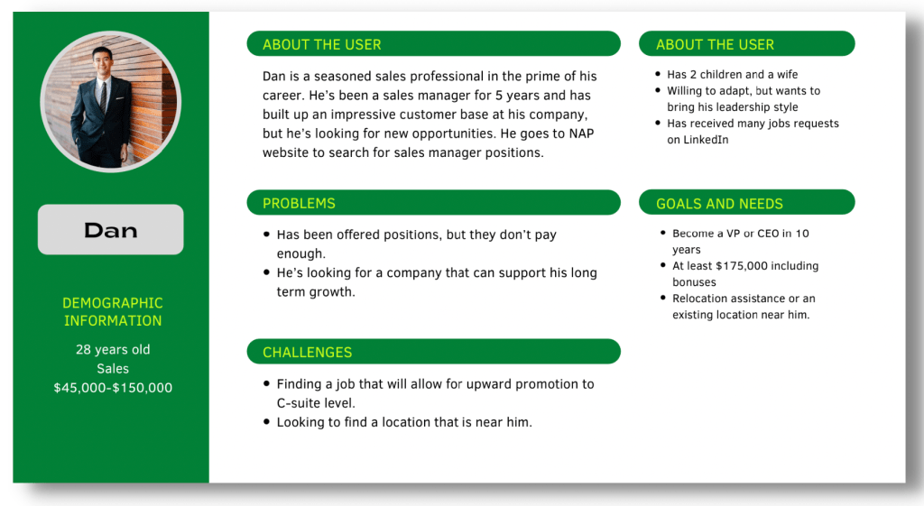
- Personas
- We targeted three main personas: The job seeker, the executive leadership representative and the small business owner looking to be acquired by NAP.
- Use Cases
- We detailed all the primary use cases for why people would use the site.
- Customer Journey
- We mapped out the journey of our target personas to ensure our design decisions met their needs.
This sitemap gave an idea to execs of how we would structure our website pages
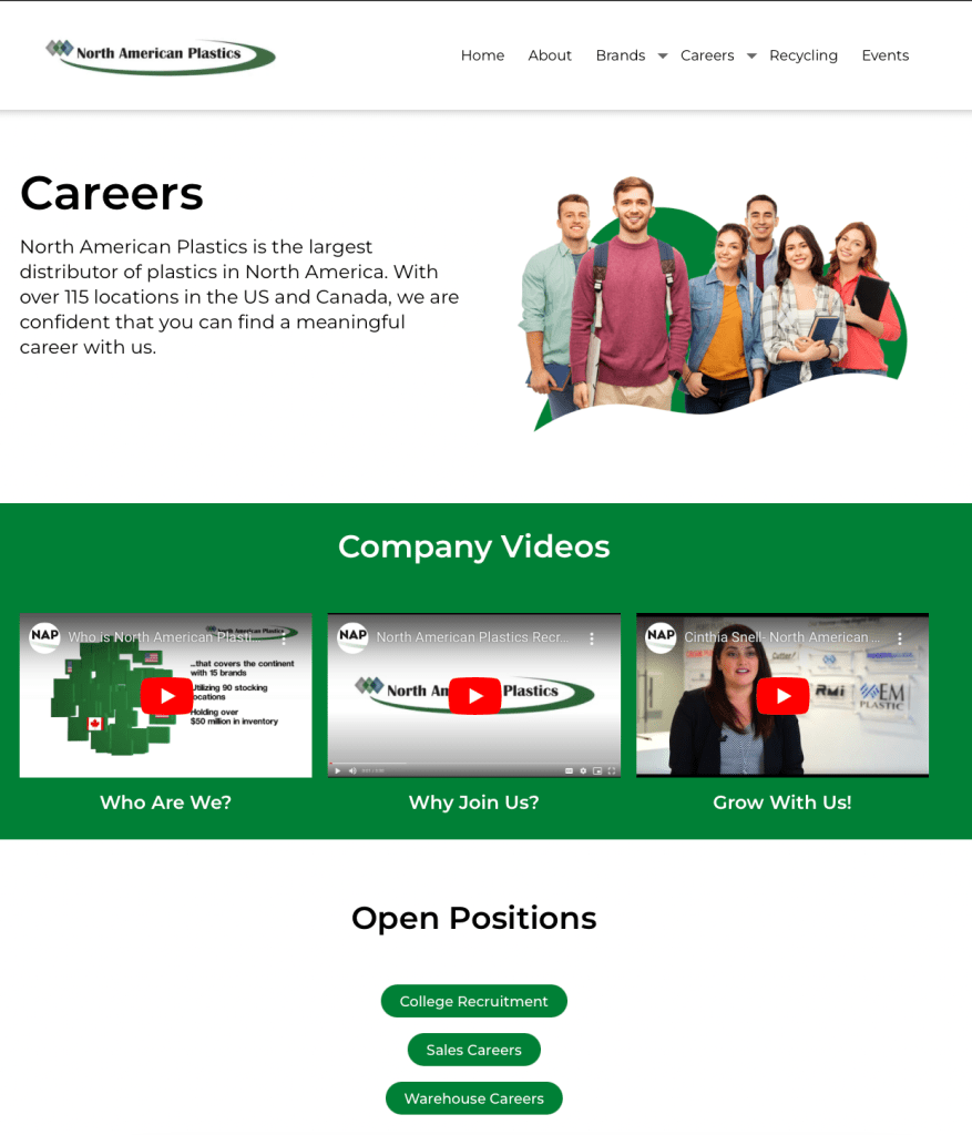
When creating personas we had to remember that not all of our visitors are buyers of plastic, sometimes they are people looking for careers at North American Plastics. Having a clean and polished website is essential for talent acquisition.
Design
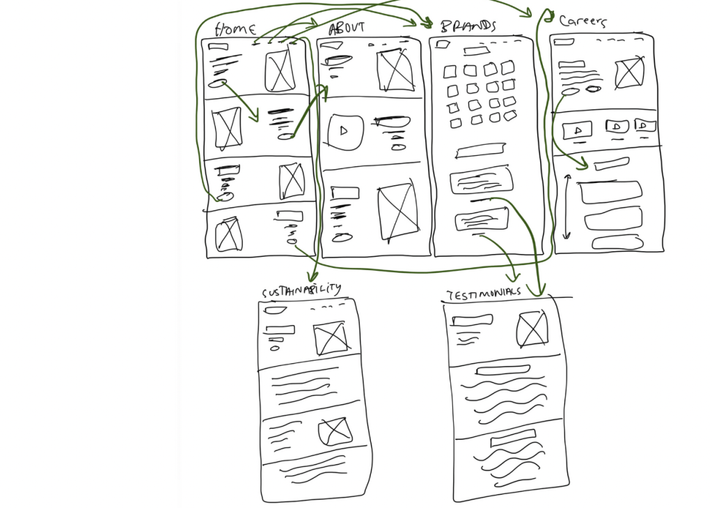
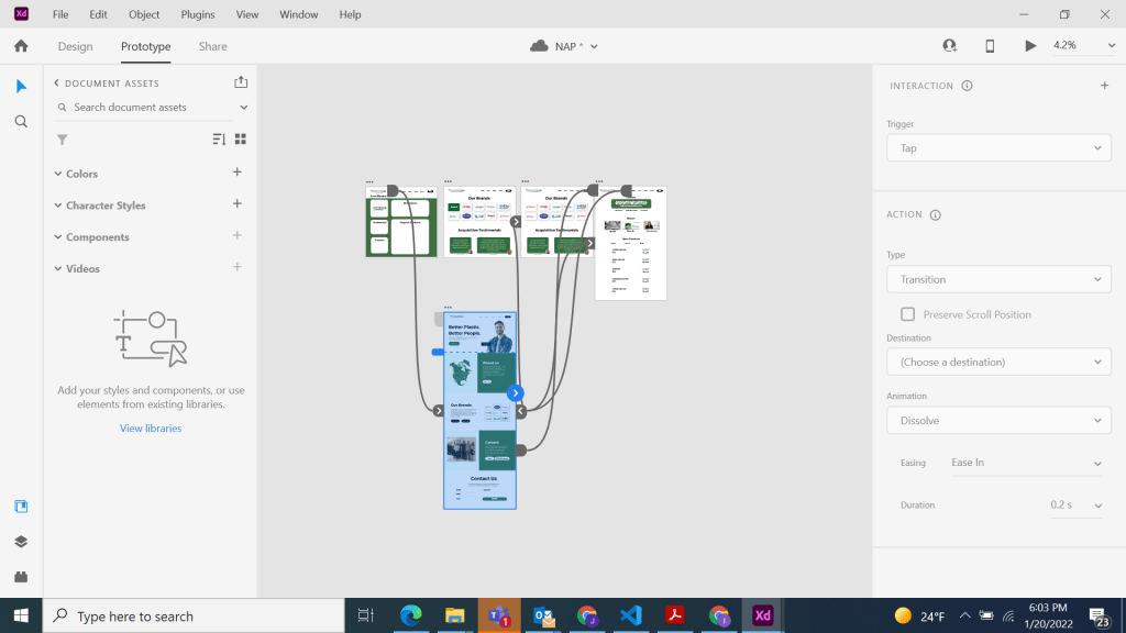
Wireframes (Figma)
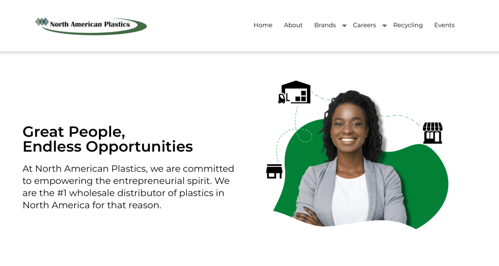
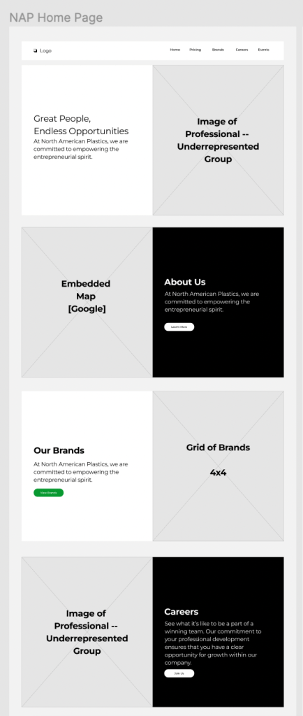
We embraced simplicity and presented a very simple ’50/50′ section template, where half of the section was text (header + text + CTA) and other half was a clear image, ideally of a person.
We ensured that the site was easy to scan, by a familiar layout. This way, users could tap into their existing schema to quickly read through the contents.
We approached this from a “templatized” format to ensure that we could quickly spin up new pages if necessary. Without dedicated developer support, ongoing maintenance and simplified editing was a top consideration.
I had a lot of fun with these wireframes, and stakeholders enjoyed seeing the design taking shape before it went live.
Design
We built out a protoype to speed up the development processing time. When flushing out the design we had three top considerations:
Color choice
NAP’s primary brand color is green…but green can QUICKLY become overwhelming on a site. We decided to use it as an accent to white instead to give the site a pop while retaining its’ brand identity.
Imagery
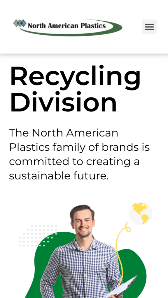
I had to design the graphics for the site too, so I focused on sourcing images of diverse people (age, ethnicity, gender, etc) and giving them a modern, organic look. Something completely contradictory to the rigid, traditional plastics industry.


Mobile responsiveness
Most of the users for our site used desktop, but that doesn’t mean it won’t change in the future. We designed a mobile-first type of experience to ensure the site can stand the test of time.
Outcomes and next steps
This design launched in January 2022 and we saw some remarkable outcomes!
Bounce Rate
The bounce rate decreased by over 17% in the first month, showing the people are more inclined to stay on our site.
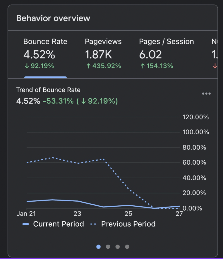
Average Page Session
Average session durations increased by over 14% after launching the site, which means people are actually interacting with our content for longer than before.
Trust
Users expressed an immediate increase in trust for our website and brand during qualitative interviews following the launch.
The redesign didn’t just make the site look prettier, it actually improved customer relations by increasing digital trust.
Since the launch of this site, we have made continuous improvements to images, layouts and other content. We’ve heard tons of valuable feedback, which encourages us to continue innovating and improving the website
