I led UX Strategy and Architecture for a homepage redesign for MarketWatch’s new product offering, MarketWatch Picks. MarketWatch Picks provides readers with expert opinions to help them make wise financial decisions for retirement, investing and everyday purchases.
Challenge
Purpose
MarketWatch Picks had a silent launch on the MarketWatch website to see if users would actually enjoy their content. They quickly took off due to organic SEO traffic and challenged competitors such as CNBC, CNN and Forbes in this niche financial news space. MarketWatch Picks needed to redesign their homepage to help them:
- Establish their brand
- Reduce bounce rate
- Increase article click through rate
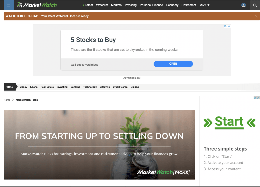
Old MarketWatch Picks Home Page
Scope
MarketWatch (MW) easily surpasses 100 million page views each month, and loyal users were beginning to become aware of the useful content MW Picks was offering. With millions of potential visitors coming to this site, the importance of starting off on the right foot was truly monumental. This could truly make or break MW Picks and their brand.
Team
I worked closely with the UX Designer for MarketWatch, while also collaborating with various UX Design and Architecture Directors to ensure we were aligned with the wider company goals and design initiatives.
Research
Research is essential to presenting an impactful and scalable design solution. I carefully carried out the following research and architecture methods to set a solid foundation for the UX Designer. These methods included:
- Competitive Analysis
- Heuristic Analysis
- Content Massing
- User Flow
- Information Architecture
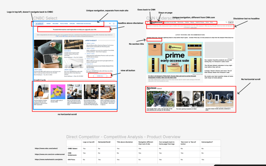
Competitive Analysis
I looked at some of MarketWatch’s primary competitors to get an idea of how they stacked up against the competition. We noticed three key themes:
- Identity Crisis
- Deciding how to establish MW Picks as its’ own brand without deviating too much from the parent brand, MarketWatch.
- Navigation
- MW Picks and MarketWatch had different navigation pathways, and we needed to position them strategically to avoid causing confusion.
- Horizontal Real Estate
- We wanted to be the only competitor in this space that offered a carousel browsing experience for articles on the MW Picks home page.
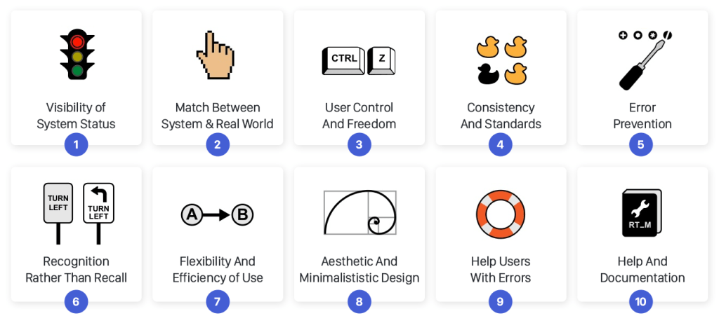
Heuristic Analysis
I conducted a heuristic analysis using Jakob Nielsen’s 10 general principles for interaction design and I discovered three primary areas of improvement.
- Aesthetic and minimalist design
- Overall, the MW Picks site was very cluttered and disorganized, resulting in various pain points for users.
- Recognition vs. Recall
- There was a general lack of intentionality with information architecture that led to user confusion.
- Flexibility and Efficiency of Use
- Product cards and interactive widgets were not always clearly defined, trustable or visually appealing.
Content Massing
At Dow Jones, UXAs utilize content massing like a “low-low” fidelity wireframe that helps us group content before going into the details. We wanted to mimic our competitors in some ways so that their users would instantly become comfortable with our site if they landed on it. The less time they take to learn how our site works, the quicker they’ll become comfortable.
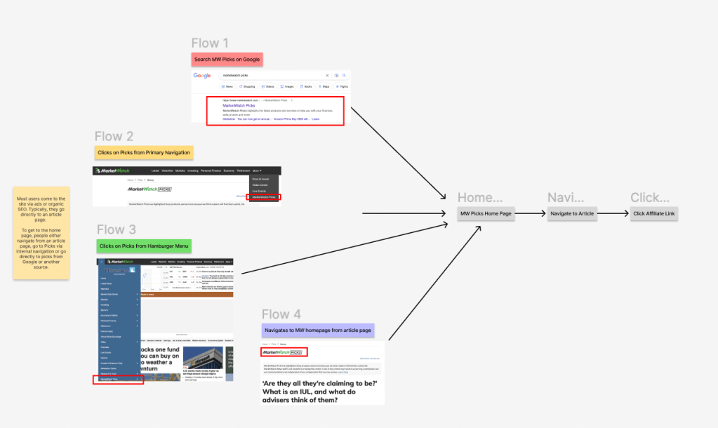
User Flow
We noticed that most people come to the MarketWatch Picks Homepage from one of three locations:
- Organic Google Search
- People see MW Picks as a top search result and click it.
- MarketWatch Navigation
- People see MW Picks in the navigation and click on it. This is not very likely due to the placement in the navigation
- From the Article Page
- Users land first on a MW Picks article page, but due to the desire to explore, they navigate to the MW Picks home page and begin to browse.
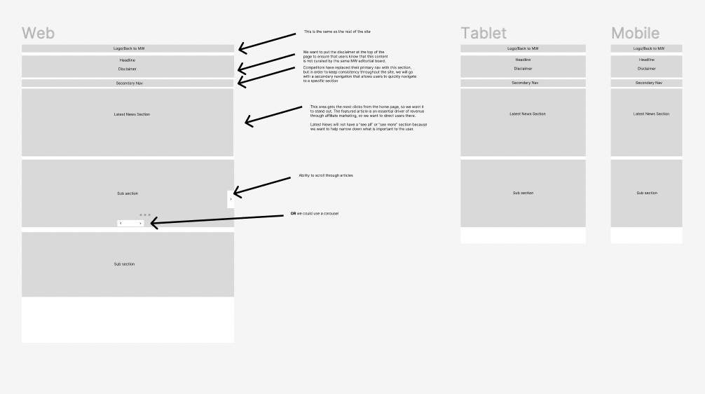
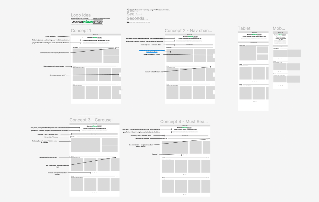
Wireframes
I created some annotated wireframes with different concepts that could solve the challenges we faced. I prioritized three main points:
- Simplicity
- The previous MW Picks home page was cluttered and disorganized. We changed that with this design.
- Brand Identity
- We established a safe amount of deviation from MW Picks and their parent brand, MarketWatch. We used a fresher layout and new design elements not yet featured on the parent site, like the carousel.
- Navigation
- We created a simple navigation structure that encourages exploration and and deep dives into new content. We also placed the link back to the MarketWatch parent home page under the ‘More’ nav item on desktop and in the hamburger menu on mobile.
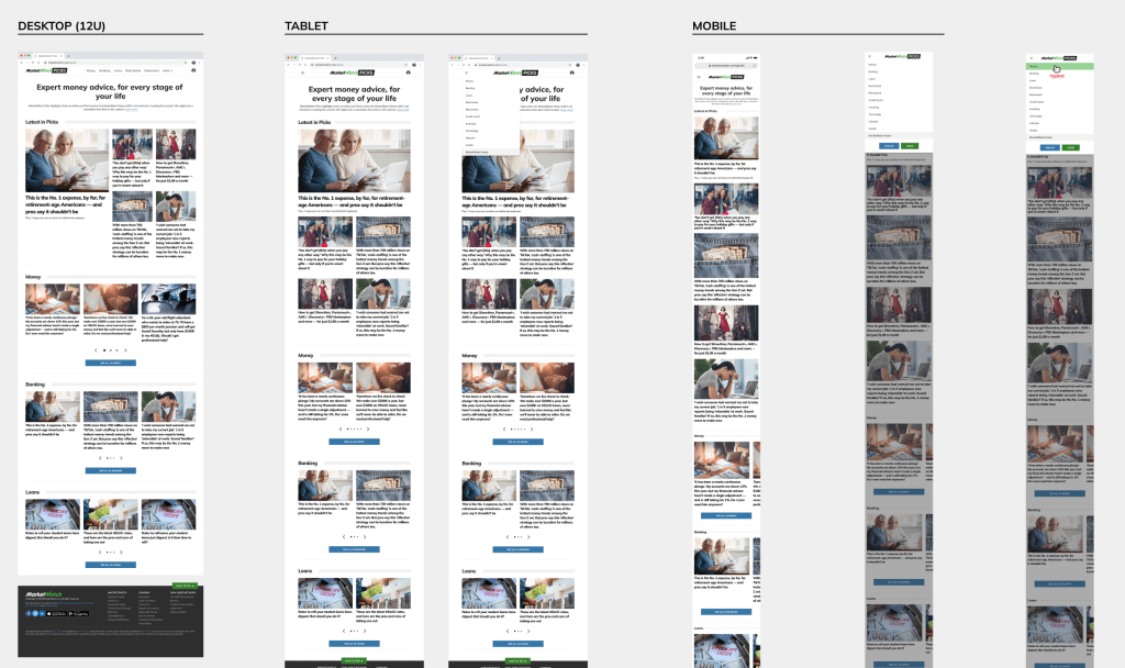
Outcomes and Next Steps
After a few weeks of collaboration with the UX Designer we reached a final, user-centered design that all of our stakeholders were pleased with. This is set to be launched as the new MW Picks home page in the first half of 2023. At the time of writing this, the dev team is putting the final touches on it. Our next steps are to:
Track Analytics
We will be analzing the data to evaluate the effect of the new design on MW Picks’ bounce rate and article click-through rate.
Seek Feedback
Whenever their drastic changes to a site, you will almost inevitably get feedback. We are looking forward to getting this feedback to see what adjustments and pivots we can make to improve the design continuously.
Accessibility
We are striving to improve the accessibility of our sites and ensure that all users of all abilities can use our product easily and effectively.
Want to see these designs in production? Go to https://www.marketwatch.com/picks?mod=top_nav and check it out. I’d love to know what you think!
If you have more questions, please send me an email at rhomanmjames@gmail.com
