MarketWatch is an international financial news company that garners over 16 million unique monthly visitors. They’re one of the most trusted and reliable companies in the financial news space, but they had one big issue. Their website was disorganized, overwhelming and inconsistent. I led a UX team composed of a designer and a researcher to complete one main task. Redesign the MarketWatch Home Page to be modern, scalable and aesthetically pleasing.
What’s The Current State?
First, let’s check out the current MarketWatch Home Page layout. To say the least…it’s A LOT of information to consume.
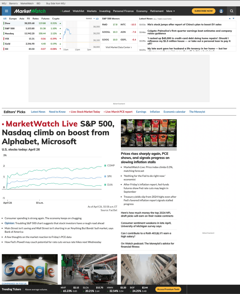
Previously, there were not any UX professionals dedicated to MarketWatch. the Product team worked directly with developers to push changes, and the result we were left with was a case of “let’s see how many articles we can fit on the page!”.
I understood their thought process behind it, but it ended up creating an overwhelming experience for users. Here’s a quote from one of our users.
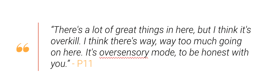
I agree with them! There’s so much great stuff on MarketWatch: articles, stock tickers, charts. But with the placement of everything plus mandatory ads for revenue, users were left confused.
Take a look at this heat map that shows where users thought the most important part of the page was:
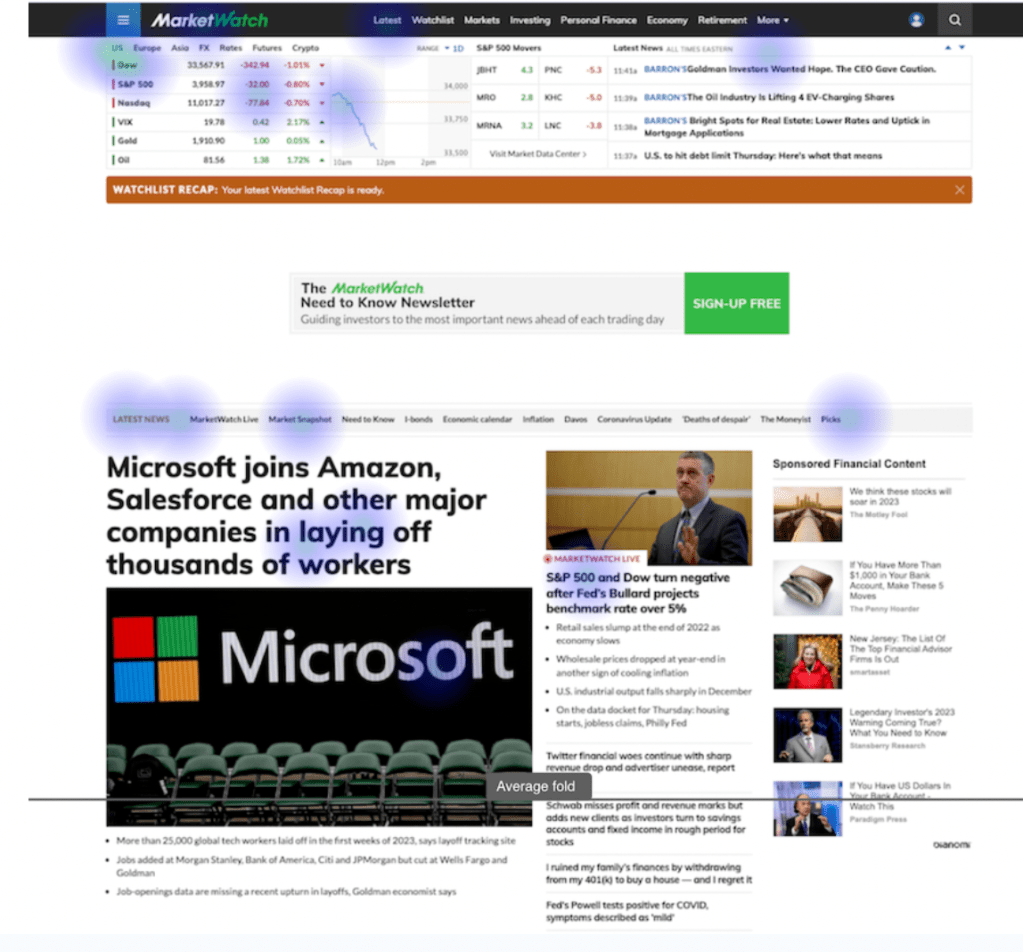
As you can see, we’ve crammed so much into such a tight space that even users are unsure what is important for them. The job of the designer is to simplify the experience for the user and ease their cognitive load, not add to it.
So, that’s what we aimed to do.
Some other things we needed to do were
- Highlight Market Data
- Something that separates MarketWatch from Wall Street Journal and other Financial news sites is the in-depth Market Data we provide. Users told us MarketWatch is their go to for Market Data so we had to make sure we weren’t changing the experience too much for our power users.
- Establish Content Heirarchy
- Initially, we failed our users when helping them determine what was the most important content on the page. With this redesign, we need to restore order to our site by aligning it with our new value proposition.
- Modernize the Design and Clean It Up
- Perception matters. When users see a cluttered website, they see a cluttered business. When they see a clean website, they see a clean business. MarketWatch needed their website to keep them competitive and improve their public perception.
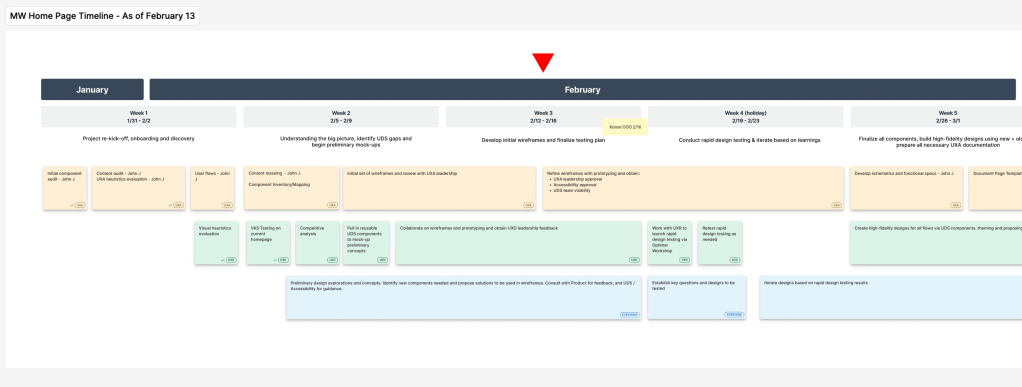
We created a timeline to keep track of our responsibilities and accurately communicate to senior stakeholders which is essential for high-visibility project like this one.
Establishing the Architecture
There are many steps to establishing the structure of a home page.
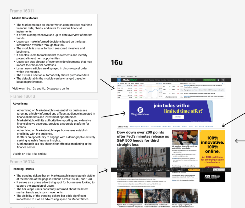
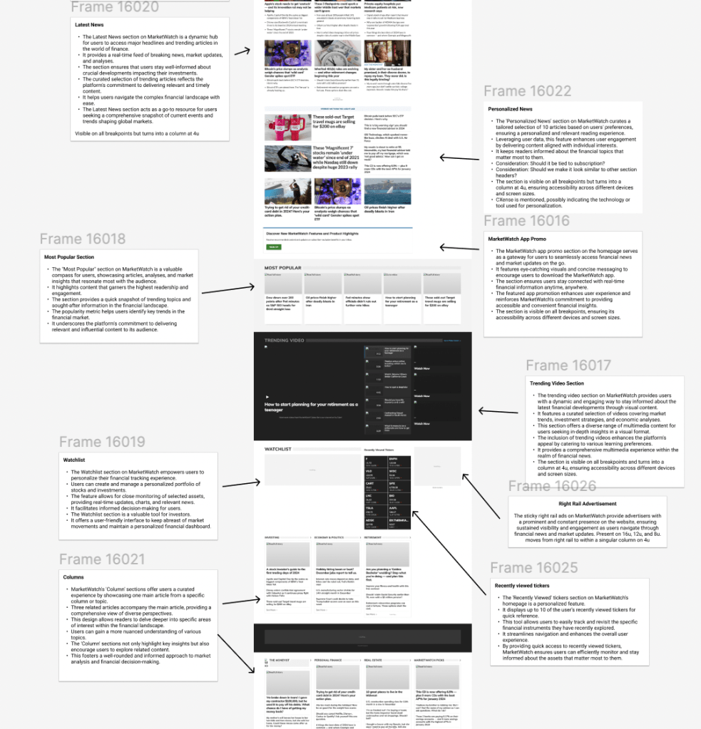
Content Audit: The first step was understanding everything that was present currently. This involved looking extensively at every single component and understanding what its purpose was. Frequently, there are instances of duplicate content, unnecessary content or erroneous content that needs to be weeded out before jumping into wireframes.
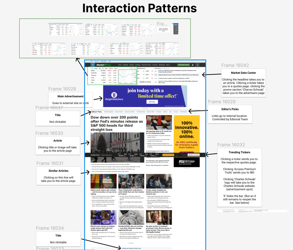
Interaction Patterns: Now that we understand the content, we need to see how it functions. Is it clickable? Does it go to an external location? Where does the data come from? Who controls the information displayed? It’s essential to understand every detail to ensure this will work properly for everyone involved.
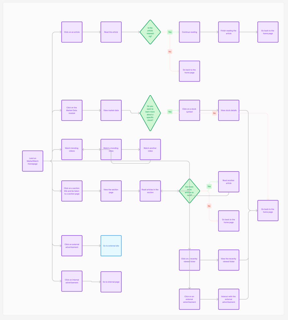
User Flows: I created user flows to map out all of the possible pathways someone could go through while on the home page. This allowed us to design for every possible scenario.
Component Mapping: We started to map out which new components could fit the purposes needed, while improving aesthetics and ensuring scalability. Working with a low fidelity method like this allows stakeholders to agree on things before we get too deep in the process.
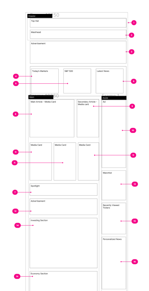
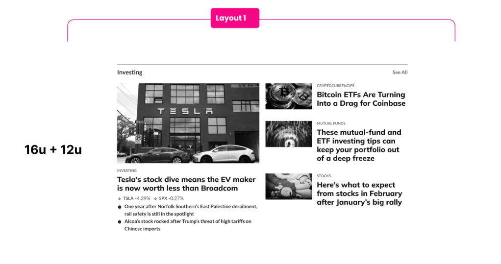
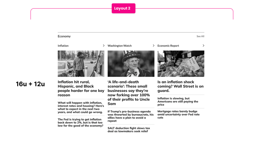
Experimental Wireframes: I experimented with many different layouts to see how this content would work together. I added notes and confirmed with stakeholders to align on key elements. I had to design for various templates for different scenarios like live coverage or an important event.
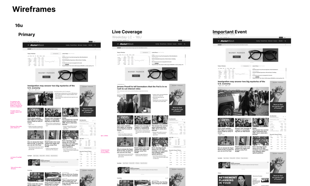
I designed two different layouts that editors could choose to feature specific content on the home page. One focuses more on key articles (Layout 1) while the other focuses more on columns, which are categories of similar articles (Layout 2).
The exploration and alignment continued for six weeks for all of the home page elements. I brought together senior stakeholders, editors, product managers, developers and design leaders to ensure we finished before the deadline and exceeded all expectations.
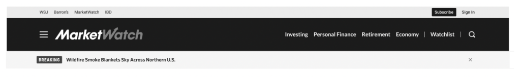
Navigation
A website’s navigation is essential to a user’s initial experience on the site. There are various forms of navigation that we needed to address.
MarketWatch’s navigation was in need of some improvements. We conducted tree tests, interviews and usability tests over the course of 6 months to come up with a new and improved navigation structure.
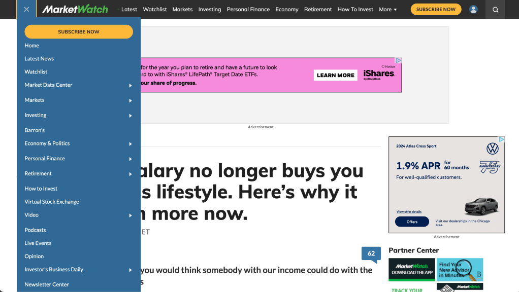
Old Navigation
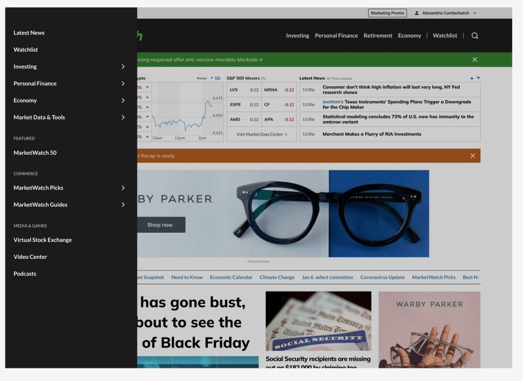
New Navigation
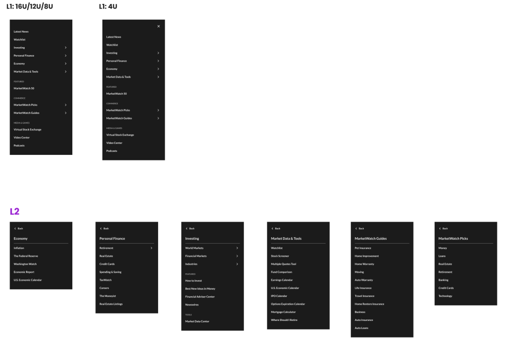
Here are the L1s and L2s that we established with the help of UX researchers and stakeholder feedback.
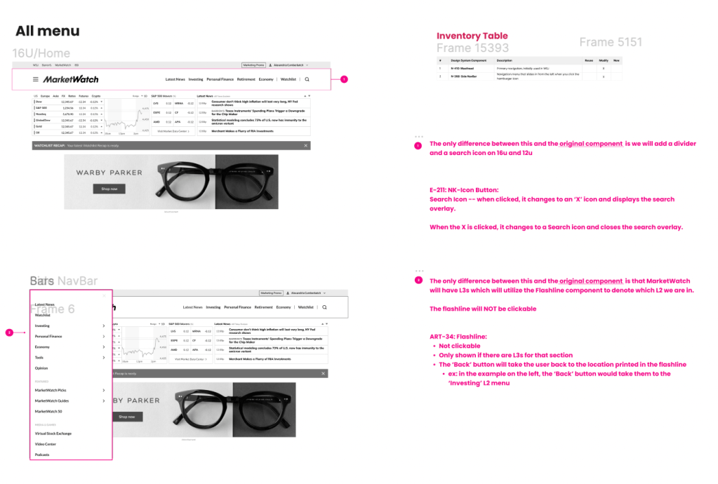
Here are some notes about the components used in this design that we passed to developers. All of these components are now in the Universal Design System for Dow Jones
We had three major successes for MarketWatch’s Navigation:
- Improved Usability
- Users could find what they needed to find, quicker
- Reduced Cognitive Load
- From changes in color choices to a reduced number of items in the primary nav and hamburger menu, we simplified the navigation items despite offering such a vast amount of content. This solved one of our biggest complaints from users.
- More Aligned With Business Goals
- MarketWatch’s value proposition initially was not reflected in its’ navigation, but with our new layout, all stakeholders agreed that we are showing the world what MarketWatch wants to be known for: Investing, Personal Finance and the Economy.
Where We Are Now
All designs have been approved, documented and handed over to developers. They are in the process of developing the new homepage now and we plan to see this live by the end of 2024.
Here are a few of the key improvements we made to the home page.
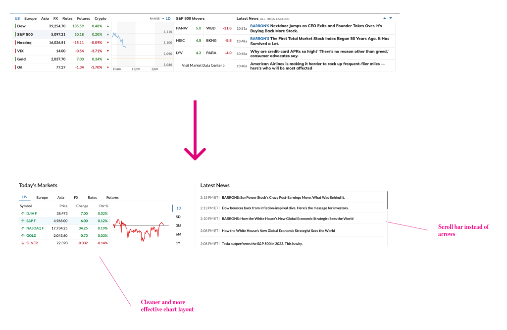
- Improved Market Data Section
The new design uses labels and spacing more effectively to focus on key data and facilitate access to latest news
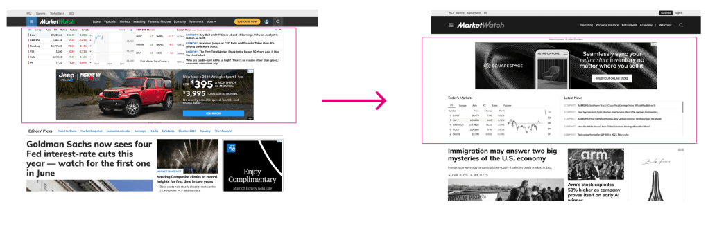
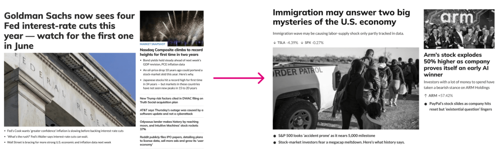
2. Updated Ad Placement
By switching the ad placement and the Markets Overview section, users can clearly see how the headlines and trending topics are affecting the current markets.
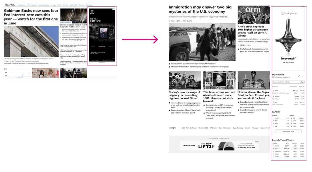
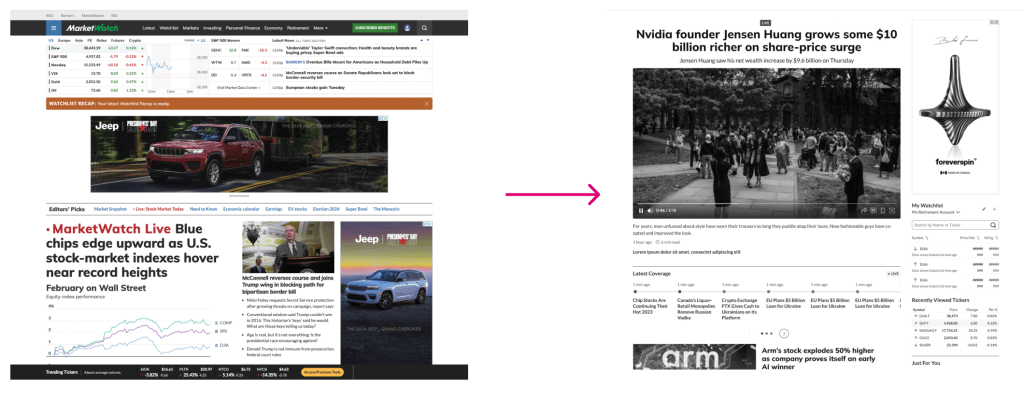
3. Utilizing the Right Rail for Personalized Content
Currently, we only have ads in the right rail. In the new design, we will have personalized content the Watchlist Widget, S&P 500 and Recently Viewed Tickers
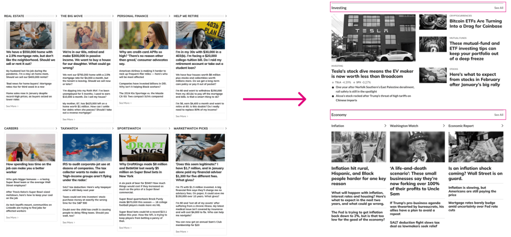
4. Clearly Defining Different Sections with Labels
Our current homepage lacks consistent section headers and labels. We’ve introduces consistent section straps throughout the page to improve scannability and readability.
5. Reducing the Unecessary Overload of Articles
Currently, we pack 12-15 articles within the top headlines section, which can overwhelm users when they arrive to the page. The new design will:
- Reduce the amount of articles in the top headlines section by 50%
- Reduce unnecessary bullet points/headlines
- Introduce short summaries to provide valuable context
- Promote the usage of tickers on important articles (important for SEO and UX)
6. Live Coverage
Introducing an interactive live coverage module with the new timeline component. The timeline may be implemented as a “Phase 2” of the project.
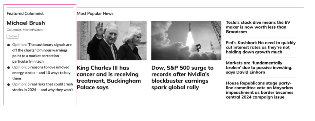
7. Featured Columnist
Introducing a new component to feature a MarketWatch columnist
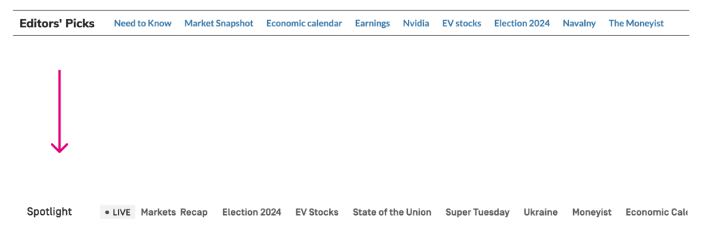
8. Spotlight
Changing Editor’s Picks bar title to ‘Spotlight’ and encourage Editors to use it in the most effective manner. “Prioritize relevant and timely content”
9. Breaking News
Introducing the Breaking News Ribbon to promote important, relevant news.
What I Learned
To say this was a massive project…would be an understatement. MarketWatch is a behemoth in the financial news world and its website needed a complete facelift to bring it into 2024 (and beyond).
There were a ton of moving parts to this project, but I learned one big lesson at the end of the day: don’t overthink it.
We didn’t need a lot of flashing bells and whistles to make this redesign successful. Focusing on function ensured that we weren’t going to design something beautiful that didn’t work. It gave us just enough room to beautify specific elements on the page to be in line with our brand and elevate our online presence at the same time.
As always, it’s a team effort. Consistent communication is the only way huge projects like this get done, and I made sure everyone was in the loop every step of the way.
I’m looking forward to seeing this one go live.
If you have any questions, email me at rhomanmjames@gmail.com
