WSJ+ Case Study
Project Overview
WSJ+ 2.0 was a complete redesign of The Wall Street Journal’s subscriber dashboard, aiming to unify top news, market data, and personalized content under a single, modern experience. Key goals included boosting engagement, increasing feature adoption, and laying the foundation for future personalization tools like topic tracking and a unified Customization Center.
The redesign focused on four core areas: the Top Stories section (renamed News For You), a combined Market Data & Watchlist widget, a new My Interests section, and a redesigned article page.
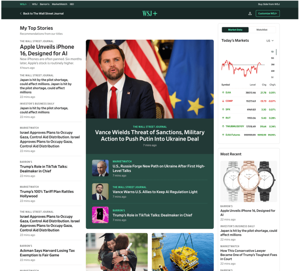
Top Stories / News For You
Problem:
Subscribers needed a centralized, easily scannable news feed that balanced editorial curation with personalization, replacing fragmented content from multiple Dow Jones brands.
Solution:
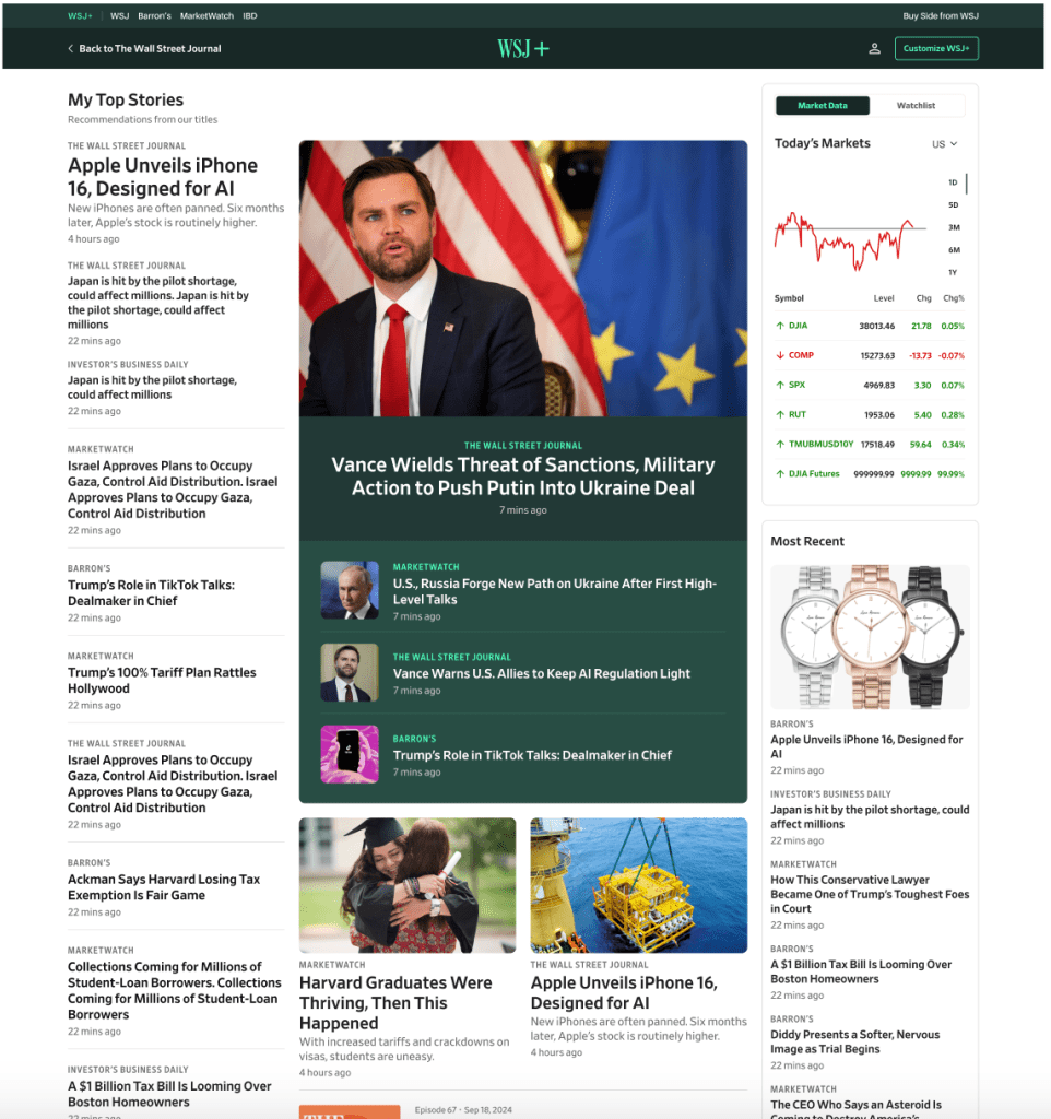
We created a modular, three-column layout:
- Left Column: 7 personalized stories based on onboarding preferences, browsing history, followed storylines, and article tags.
- Middle Column: 3 top stories across Dow Jones, plus a hero multimedia card and podcast highlights.
- Right Column: A customizable Markets widget and More WSJ+ content widget.
Outcome:
The redesigned section delivered relevant top news while allowing subscribers to easily discover and engage with new content. Editorial oversight ensured diversity in story types, formats, and perspectives.
My Interests / Browse Dow Jones
Problem:
Users wanted more control over what topics and brands they followed, rather than receiving a static set of categories.
Solution:
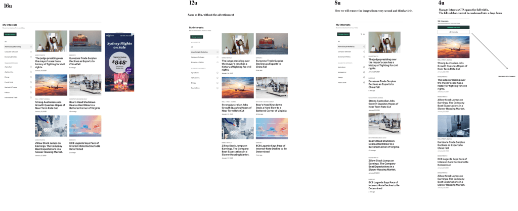
The My Interests section allowed subscribers to browse and follow topics across Dow Jones brands. It featured a flexible, modular layout:
- Personalized by onboarding preferences, end-of-article tags, and the Customization Center.
- Cold-start defaults ensured users saw at least the top 4 categories if no preferences were set.
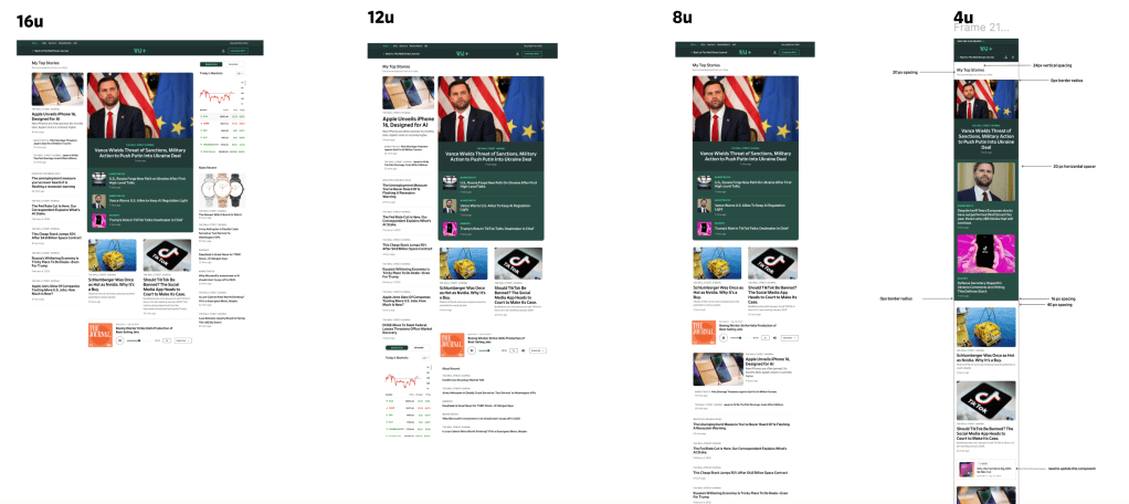
- Responsive design adapted to desktop, tablet, and mobile, including carousels on smaller screens.
Outcome:
Subscribers gained a tailored experience, reducing content clutter and increasing relevance across their dashboard.
Article Page & Related Articles
Problem:
Subscribers needed a consistent article experience that connected them to relevant market data and related content.
Solution:
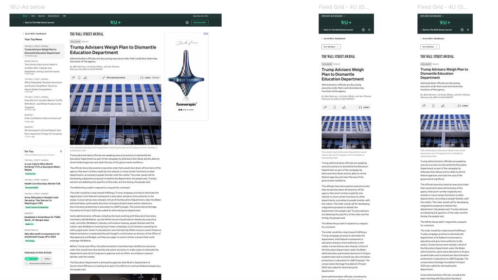
The redesigned article template integrated:
- Left column: highlighted story and list cards.
- Middle column: hero card, highlighted cards, and podcasts.
- Right column: Markets and More WSJ+ widgets.
- Customization Center options allowed subscribers to reorder or hide modules.
Outcome:
The article page provided a cohesive reading experience, improving engagement with multimedia, related articles, and personalized market insights.
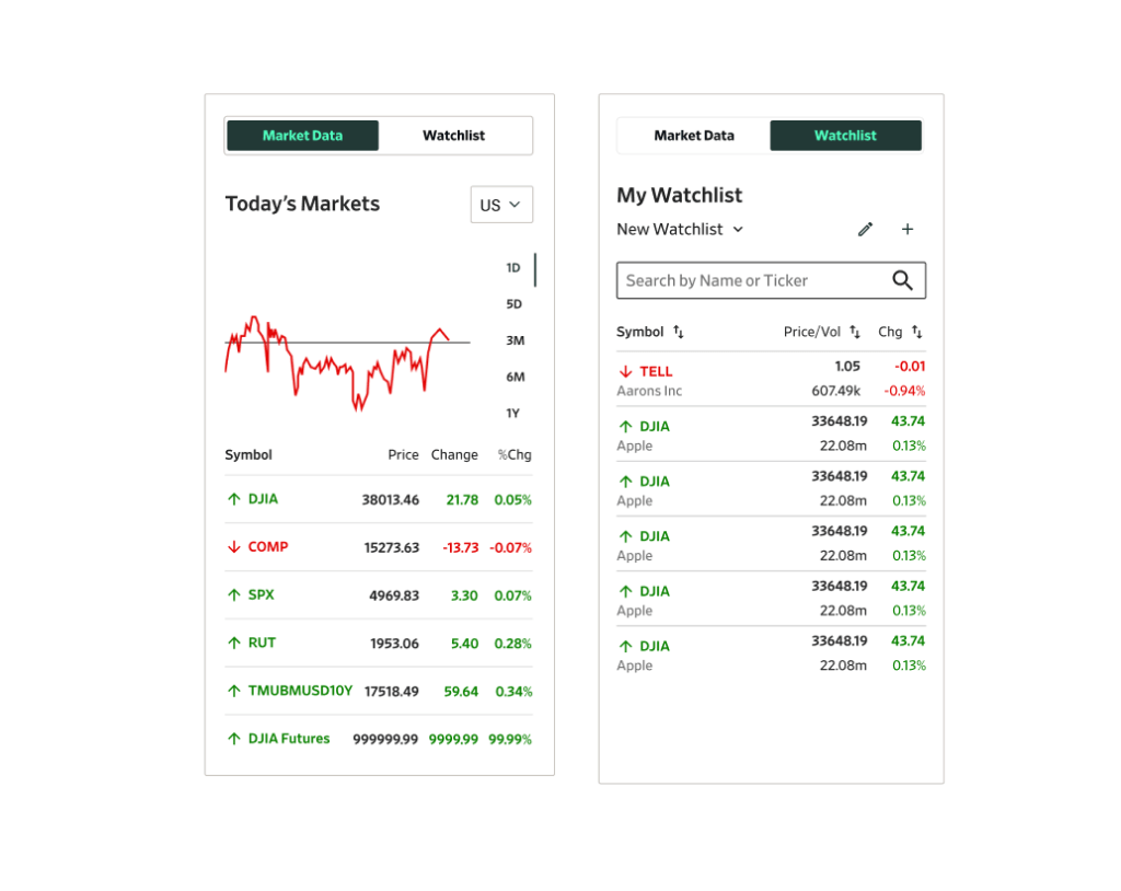
Markets & Watchlist
Problem:
Market data and watchlists were previously scattered, reducing discoverability and usability.
Solution:
We combined both into a single, customizable widget:
- Watchlists synchronized across devices.
- Top movers highlighted most active stocks daily.
- Users could set defaults and personalize content through the Customization Center.
Outcome:
Subscribers could track markets efficiently, enhancing the value of WSJ+ as both a news and financial insights platform.
Key Results
- Unified dashboard with consistent typography, iconography, and modular layout.
- Personalized experiences across Top Stories, Storylines, and My Interests.
- Streamlined navigation and enhanced discoverability of WSJ+ features.
- Built scalable foundation for future tools like the Customization Center and topic tracking.
Conclusion
WSJ+ 2.0 transformed the subscriber dashboard into a cohesive, engaging, and personalized hub. By combining editorial curation with user-driven customization, the redesign strengthened the WSJ brand, increased engagement, and prepared the platform for future growth in personalization and content innovation.
